Shop by concern
An editorial index of up to six entry points organized by the problem a shopper wants to solve rather than by product type. Each concern is an ordinary link to a collection, a page, or any URL. It does not ask questions or recommend anything.
- Merchant-addable
- Yes
- Settings
- 29
- Block types
- 1
- Max blocks
- 6
- File
sections/concern-navigator.liquid
Used by default on: Home
When to use it
Home pages, when your customers shop by need — "Dullness", "Redness", "Dryness" — rather than by product type.
Setting it up
- Add the section and write the eyebrow, heading, and body text under Content. Choose a Heading size.
- Add a Concern block per entry point, up to six. Under Destination, choose Link type and fill in the matching collection, page, or custom link.
- Under Card content, write a Heading, Body text, and Link label. Leave the heading blank to use the collection or page title.
- Add an Image to each concern. Leave it empty to use the collection image, then the first product's photo in that collection.
- Under Style, choose Mobile layout, then set the image shade, tall feature shape, card spacing, and the Section color scheme and Card color scheme.
Where the content comes from
Blocks own the wording, image, and destination of each concern, and their order. Shopify collection and page data supplies the title and image whenever a block leaves them blank.
Notes and cautions
- Use your customers' words, not your category names. "Dullness" outperforms "Exfoliants" because it is what the customer would actually say.
- On desktop the first concern is the wide card beside the heading and the second is the tall feature card below it, so put your two most important concerns first. Concerns three to six sit in a row beside the feature, and the arrangement adapts when you have one, two, or three.
- If Link type is set to one option but only another link field is filled in, the card uses the link you entered instead of going dead. A card with no link at all still displays, but is not clickable.
- Keep images about 4:5 portrait. Show image shade lays the card color over part of each image to keep the text readable, and Shade opacity and Shade coverage tune it. With the shade off, choose images that keep the text readable on their own.
- Mobile layout defaults to Carousel, a swipeable row. Choose Stacked to show every concern in a column. It only matters when there is more than one concern.
- Navigation label is read aloud by screen readers to describe the group of links. It is not shown on the page, and it falls back to the heading when left blank.
- Tall feature shape gives the second card an Arch, Soft corners, or Square outline. Turn on Use custom corner radius to override the theme card radius on every card.
How the concern cards are arranged
Shop by concern is a set of large image cards, one per concern. Each card is an ordinary link, so shoppers can open any of them directly. The section does not ask questions or recommend a product. The arrangement of the cards depends on how many you add and on the screen size.
On desktop
The heading and introduction sit at the left, with the first concern as a wide card beside them. The second concern is a tall feature card beneath the heading. Concerns three to six sit in a row beside it. With six concerns, the arrangement looks like this:
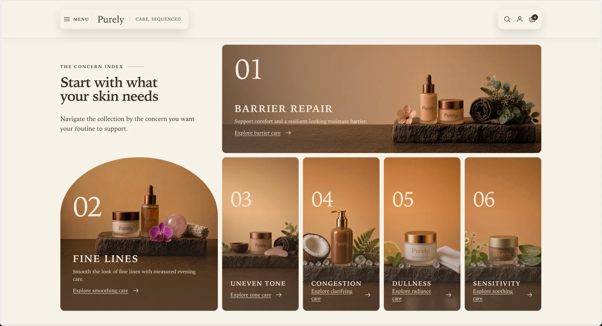
Put your two most important concerns first, because they get the most space.
With fewer concerns the cards grow to fill the row. Four concerns split the second row between the tall card and two wide cards:
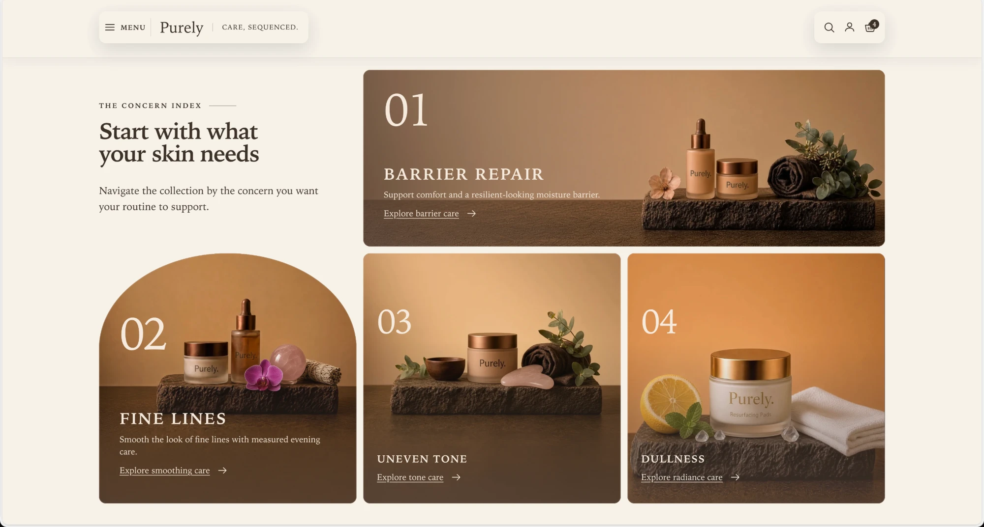
One, two, and three concerns each have their own arrangement as well, so you do not need to add placeholder cards to keep the layout full.
Tall feature shape sets the outline of the second card: Arch, as shown above, Soft corners, or Square.
On a phone
Mobile layout chooses how multiple concerns display below 750px.
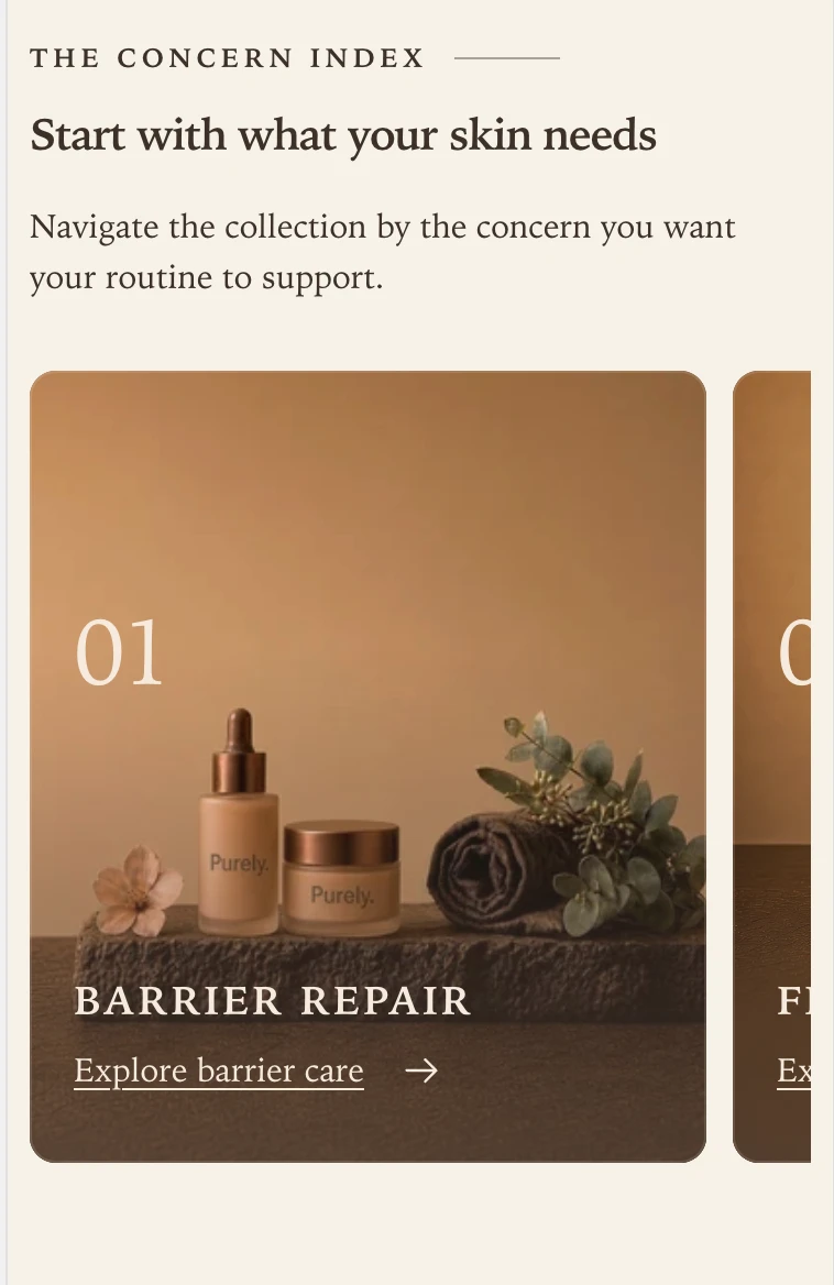
Carousel is the default. The cards sit in a single row that shoppers swipe sideways. The next card is partly visible at the edge, which shows there is more to swipe to.
Stacked shows every concern in a single column, one card above the next. Use it when you want every concern visible without swiping, or when you have only a few.
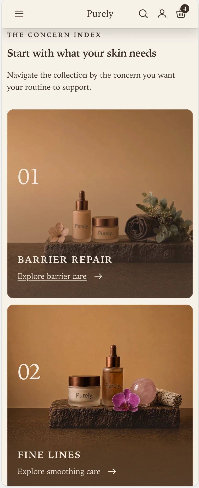
The setting only matters when the section has more than one concern. A single concern is always one full-width card.
What each card shows
- Show concern numbers adds the large number (01, 02, and so on) in the top corner of each card.
- Heading and Body text appear on the card. Leave the heading blank to use the title of the collection or page you link to.
- Link label is the text beside the arrow, such as
Explore barrier care. - Image is the card photograph. Leave it empty to use the collection image, then the first product’s photo in that collection. Use portrait images of about 4:5, because the narrow cards crop to a tall shape.
- Show image shade lays the Card color scheme over part of each image, so the text stays readable. Shade opacity sets how strong it is, and Shade coverage sets how far it reaches up the image. In these screenshots the shade is what darkens the lower part of each photograph.
If you turn the shade off, choose images that stay calm and even behind the text on their own.
Section settings
Every setting on the section itself, in the order it appears in the theme editor. Group headings match the editor's own grouping.
Content
Describes this group of links for screen reader users.
Style
Choose how multiple concerns display on mobile. This setting applies when the section has more than one concern.
Shows each concern card's body text on mobile. Desktop body text stays visible.
Adds the card color scheme over part of each image to support text contrast. When off, use images that keep the card text readable.
Controls how far the shade extends across each image.
Fades the section in on scroll. Respects the theme animation setting and reduced motion.
Blocks
Blocks are added, reordered, duplicated, and removed inside the section. Each type has its own settings.
Concern concern
Destination
Uses the matching field below. If that field is empty, the first other link you enter is used instead.
Card content
Leave blank to use the selected collection or page title.
Replaces the selected collection image. Use a wide composition for the first card when showing three or more concerns. 4:5 aspect ratio recommended for tall cards.
Optional image for screens below 750px. Leave blank to use the main image or collection image. 1:1 or 4:5 aspect ratio recommended. Set each image's focal point to adjust its crop.