Icon list
A compact band of up to four reassurance points, each with an icon, a short heading, and a line of description, under a heading of its own.
- Merchant-addable
- Yes
- Settings
- 13
- Block types
- 1
- Max blocks
- 4
- File
sections/icon-list.liquid
Used by default on: Home, page.our-standards
When to use it
Directly under a hero, or above the footer, as a trust or benefit band. Delivery, returns, secure checkout, and a simple daily routine all fit.
Setting it up
- Add the section and write the Eyebrow and Heading under Section content. Italicize a few words in the heading for emphasis, as the default does.
- Choose a Layout: Icons with text puts each icon beside its words, and Centered icons stacks the icon above them.
- Add an Icon item block per point, up to four. Write a short Heading and Description for each.
- Pick an Icon style for each item, or leave Automatic sequence to cycle through the first four icons in order.
- Under Appearance, set the Heading size, Header artwork, Artwork tilt, Color scheme, and padding.
Where the content comes from
Section settings own the eyebrow and heading. Blocks own each icon, heading, description, and their order.
Notes and cautions
- Four items is the ceiling, and two to four reads best. The section sets its columns from the number of items, so three items fill the row rather than leaving a gap.
- There are fourteen icon styles besides the automatic sequence: four everyday illustrations, three beauty tools, and seven service symbols for delivery, returns, secure checkout, payment, guarantee, support, and gifts. Use the service symbols for policy points.
- Custom icon replaces the chosen style. Use a square image with a transparent background so it sits cleanly in the circle.
- Header artwork is the small illustration between the two rules above the heading, and Artwork tilt angles it. It is decorative and hidden from screen readers.
- On a tablet, Icons with text scrolls sideways when the points do not fit. On a phone the items stack, each with its icon beside its text, whichever layout you chose.
- Leave a Heading or Description blank and that line simply does not appear, so a label-only strip is possible.
Choose a layout
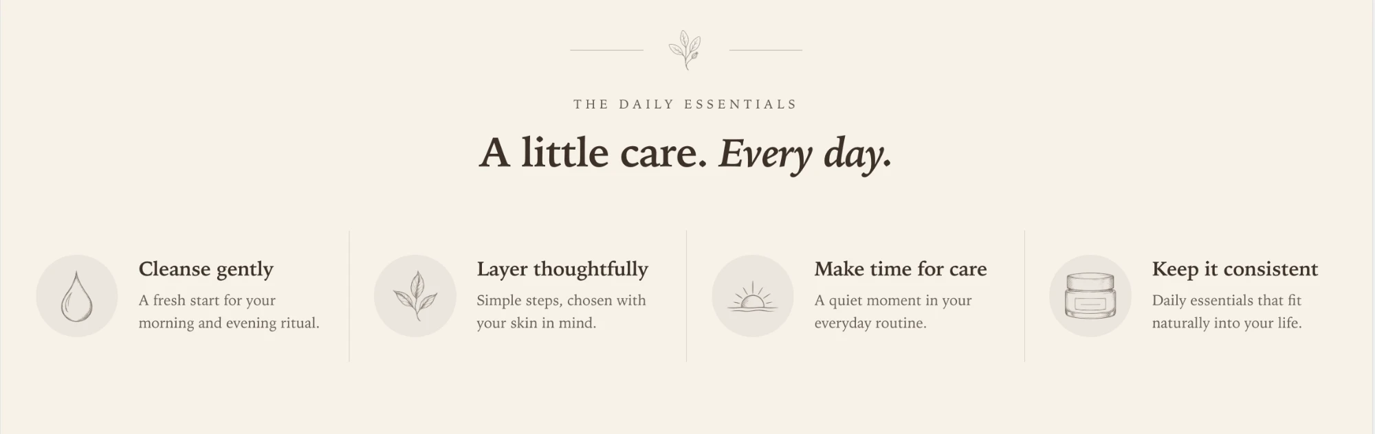
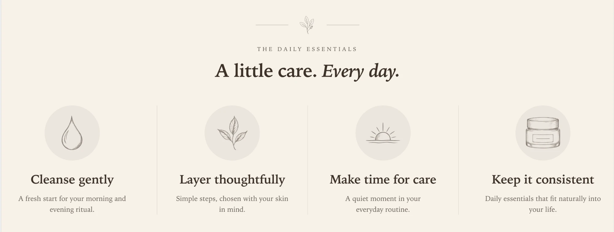
The icon list has two layouts, set with Layout under the section settings. Both show the same content: a header artwork, an eyebrow, a heading, and up to four icon items. Only the arrangement of each item changes.
Icons with text
The icon sits beside its heading and description. Thin dividers separate the items. This is the default, and it keeps the band short, so it suits a strip directly under a hero.
Centered icons
The icon sits above its heading and description, and each item is centered in its column. The band is taller and gives each point more weight, which suits a section that stands on its own.
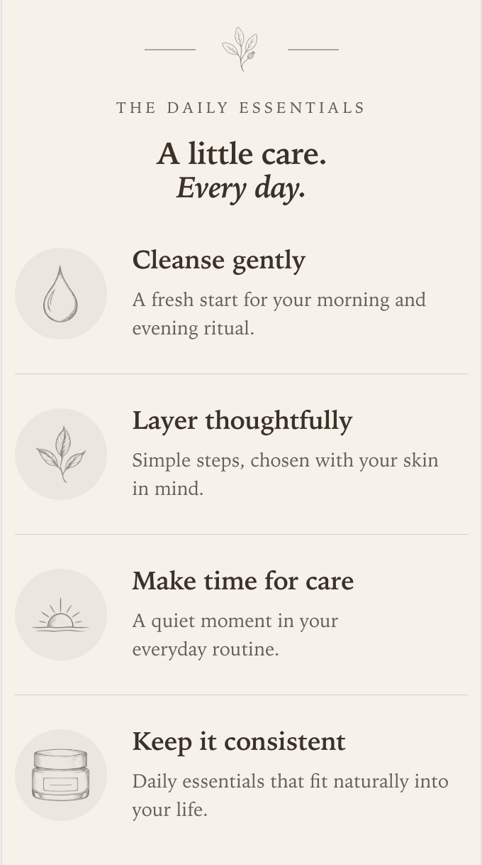
On a phone
On a phone the items stack in a single column, each with its icon beside its text and a divider between them. Both layouts use this arrangement below 750px, so you do not need to choose one for mobile.
On a tablet, Icons with text scrolls sideways when the items do not fit in a row.
Icon style and Automatic sequence
Each item has an Icon style. New items start on Automatic sequence, which picks the icon from the item’s position in the list:
| Position | Icon |
|---|---|
| 1st item | Droplet |
| 2nd item | Botanical sprig |
| 3rd item | Sunrise |
| 4th item | Skincare jar |
That is the icon set in the screenshots above. It gives a varied, matching row with no setup, and it never repeats an icon because the section holds four items at most.
Because the choice follows position, it moves with the item:
- Reordering items reassigns their icons. Drag the third item to the top and it becomes the droplet.
- Removing an item shifts the ones after it. Delete the first item and the old second item becomes the droplet.
- Position counts every item, not only automatic ones. If the second item has a fixed style, the third item still takes the sunrise, not the botanical sprig.
Choose a specific style when an icon should stay with its point, such as Delivery truck for a shipping item. Fixed styles do not change when you reorder. The list also includes three beauty tools (lipstick, makeup compact, and makeup brush) and service symbols for returns, secure checkout, payment, guarantee, support, and gifts.
Custom icon overrides the style entirely. Use a square image with a transparent background so it sits cleanly in the circle.
Header artwork
The small illustration between the two rules above the heading is Header artwork, and Artwork tilt angles it. It is decorative only and is hidden from screen readers.
Section settings
Every setting on the section itself, in the order it appears in the theme editor. Group headings match the editor's own grouping.
Section content
Section settings own the heading. Blocks own each icon, heading, description, and their order.
Layout
Appearance
Blocks
Blocks are added, reordered, duplicated, and removed inside the section. Each type has its own settings.
Icon item icon_item
Use a square transparent image to replace the selected icon.