Shop the ritual
One lifestyle photograph with a numbered marker pinned over each product in it. Choosing a marker, or the matching step in the list beside it, swaps a purchase panel for that product, so a flat-lay becomes the shopping surface for the whole set.
- Merchant-addable
- Yes
- Settings
- 28
- Block types
- 1
- Max blocks
- 6
- File
sections/shop-the-ritual.liquid
Used by default on: Home
When to use it
The home page, beneath a featured product or a hero, when a routine or set is best understood as one picture. Works with up to six products.
Setting it up
- Add the section and write the Eyebrow, Heading, and Body text under Content.
- Upload the photograph under Image and choose an Image ratio. Add a Mobile image only if the photograph needs a different crop on phones.
- Add a Step block per product, up to six. Pick the Product, give the step a Step name such as Cleanse, and write one line of Guidance.
- Move each step's marker under Marker position until it sits on its product in the photograph. Set the mobile position separately.
- Under Product panel, choose whether to show the price, Enable add to cart, and Show link to the product page.
- Choose Use a full size image, Image position on desktop, and Show markers on the image, then set the Color scheme and padding.
Where the content comes from
Shopify product data owns the title, image, price, compare-at price, variants, and availability shown in the panel. Step blocks own the order of the ritual, each step's name and guidance, and where each marker sits on the photograph. No metafield is involved.
Notes and cautions
- A step with no product is hidden from shoppers, and a section with no product in any step does not appear at all. The four steps in a new section start empty, so pick a product for each before publishing.
- Every step works without JavaScript. The markers and the step list are two controls for the same choice, so either one selects the product, and the arrow keys move between steps.
- Step name falls back to the product title. Image on a step replaces the product photo in both the panel and the step list, which is useful when a product's main image is a white-background cutout.
- A product with more than one variant shows a variant picker in the panel, and sold-out variants are labeled. A product that can only be bought on a subscription links to its product page instead of showing Add to cart.
- Markers sit on the image at a percentage from the left and from the top, so the same position lands on the same spot at any size. Mobile positions apply below 990px, where the section stacks.
- The photograph is always cropped to the Image ratio you choose at every screen size, so the crop you place markers against is the crop every shopper sees. A Mobile image swaps the picture but keeps that ratio.
- Show markers on the image can be turned off for an editorial look. Steps stay selectable from the list.
Build a shoppable ritual
Shop the ritual turns one photograph into a small store. You place a numbered marker on each product in the picture. A shopper taps a marker, or the matching step in the step list, and the panel changes to that product with its name, price, and an add to cart button. One picture stands in for the whole set.
On desktop the photograph takes one side. The purchase panel and the numbered step list sit beside it.
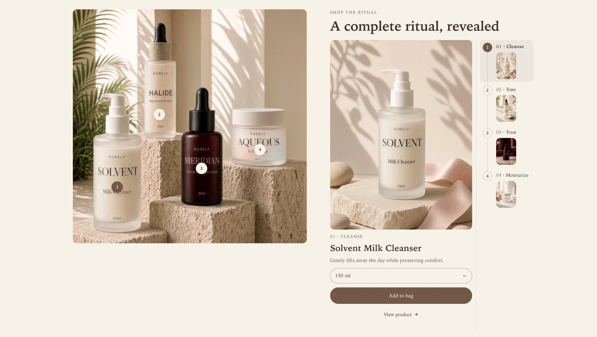
Everything a shopper sees in the panel comes from your Shopify product. What you write in this section is the ritual around it: the order of the steps, what each step is called, a line of guidance, and where each marker sits.
Choose the photograph first
The photograph decides most of the section, so settle it before you add steps.
- Use one image with every product visible and some room around each, such as a flat lay or a styled shelf. 2000 x 2000px is enough for any layout.
- Image ratio crops the photograph: Portrait, Square, or Landscape. The crop is the same on every screen size, so the picture you position markers on is the picture every shopper sees.
- Mobile image is optional. It swaps the picture below 990px, where the section stacks, but it keeps the ratio you chose. Use it when a phone needs a tighter crop of the same scene.
- Use a full size image gives the photograph the larger share of the row. The image still keeps its ratio and stays inside the page width. Image position on desktop puts the photograph on the left or the right.
If you have not uploaded a photograph yet, the section shows a placeholder so you can still set up the steps.
Add the steps
Add one Step block per product, up to six. A new section starts with four steps that have no product yet. A step does nothing for shoppers until you pick one.
| Setting | What it does |
|---|---|
| Product | The product shown in this step’s panel. A step without one is hidden from shoppers. |
| Step name | The short name beside the step number, such as Cleanse, Treat, or Protect. Blank uses the product title. |
| Guidance | One line of advice for using this product in the ritual. |
| Image | Replaces the product photo in the panel and the step list. Leave it empty to use the product’s first image. |
Steps are numbered by their order in the editor, so dragging a step up or down renumbers the markers and the list together. If no step has a product, the section does not appear on the live store at all, rather than showing an empty panel.
Place the markers
Each step has a marker on the photograph. Horizontal position and Vertical position place it as a percentage from the left and from the top, so a marker stays on its product whatever size the photograph is shown at.
- Select a step in the editor. Its panel opens, which makes it easy to see which marker is which.
- Move the two position sliders until the numbered dot sits on the product, near its edge rather than over its label.
- Set Mobile horizontal position and Mobile vertical position for the same step. They apply below 990px. If you added a Mobile image, position against that crop. If not, the two positions are often close together.
Turn off Show markers on the image for a cleaner photograph. The steps stay available in the step list.
What the shopper can buy
The panel follows the settings under Product panel:
- Show price includes the current price, and the compare-at price when the product is on sale.
- Enable add to cart adds the chosen variant to the cart and opens the cart drawer. Turn it off for an editorial ritual that only links out.
- Show link to the product page adds a link to the full product page.
A product with more than one variant shows a variant picker in the panel, and sold-out variants are labeled as sold out. A product that can only be bought on a subscription cannot be added directly, so its panel links to the product page instead. Show product images in the step list and Product image ratio control the thumbnails in the list and the larger picture in the panel.
On a phone
Below 990px the section stacks: the heading, then the photograph with its markers, then the step list as a single row of numbered thumbnails, then the selected product’s panel. The marker positions you set under Mobile horizontal position and Mobile vertical position apply here.
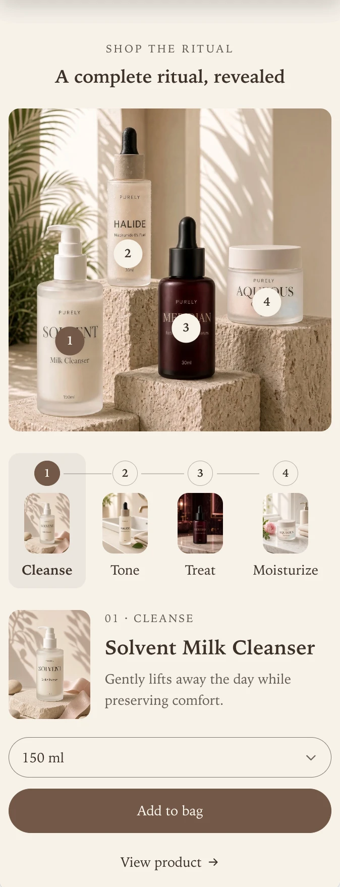
The markers sit on top of the product labels in this photograph, so place them on a plain part of each product, such as the shoulder of a bottle or the lid of a jar, rather than over its name.
Works without JavaScript, and from the keyboard
The markers and the step list are two controls for one choice, so either selects the step, and the arrow keys move between steps. Choosing a step brings the section back into view if the shopper had scrolled past it. The whole section still selects and adds to cart with JavaScript turned off.
Panel and marker changes use your theme’s global motion style, so No motion in theme settings, or a shopper’s reduced motion preference, makes the change instant.
If something looks wrong
| What you see | What to check |
|---|---|
| The section is missing from the page | No step has a product. Open a step and choose one. |
| A marker is not on its product | Adjust that step’s position sliders. Mobile has its own pair. |
| Markers are right on desktop and wrong on a phone | Set the mobile positions, and check whether you uploaded a Mobile image. |
| There is no add to cart button | Enable add to cart is off, or the product is subscription-only and links to its page. |
| A step name shows the full product title | Step name is blank. Write a short name. |
| The marker numbers are not visible | Show markers on the image is off. The step list still works. |
Section settings
Every setting on the section itself, in the order it appears in the theme editor. Group headings match the editor's own grouping.
Content
Image
2000 x 2000px .jpg recommended. It is cropped to the ratio below.
Used below 990px, where the section stacks. It keeps the image ratio above. The main image is used when this is empty.
Used at every screen size, so the same crop of the image appears on every device.
Gives the image the larger share of the row and ranges the copy to its left. The image ratio and the page width still apply.
Steps
Steps stay selectable from the list when markers are hidden.
Used for the product image in the panel and in the step list. Images are cropped to fill the space.
Product panel
Products sold only on a subscription link to the product page instead.
Style
Follows the animation settings in theme settings.
Padding
Blocks
Blocks are added, reordered, duplicated, and removed inside the section. Each type has its own settings.
Step step
The step is hidden from customers until it has a product.
Shown beside the step number, such as Cleanse.
Replaces the product image in the step list and the product panel.