Hero banner
The page-opening hero. Each Hero scene block is one full-width scene with its own media, copy, and buttons — add a second scene and the section becomes a slideshow.
- Merchant-addable
- Yes
- Settings
- 42
- Block types
- 1
- Max blocks
- 8
- File
sections/hero-banner.liquid
Used by default on: Home
When to use it
The top of the home page, and landing pages.
Setting it up
- Add the section as the first item on the template.
- Set Desktop height and Mobile height. The hero always runs edge to edge; these set how tall it is.
- Open the Hero scene block, pick a Scene layout, and add your media, heading, and buttons.
- Under Desktop layout, set Content position and Content surface so the text stays readable over your image.
- Under Mobile layout, set Mobile scene layout. Mobile has its own controls — it does not inherit the desktop ones.
- Add more Hero scene blocks only if you want a slideshow, up to eight, then set Motion.
Where the content comes from
Blocks own all hero content. The section owns the height, the color scheme, and the motion settings shared by every scene.
Notes and cautions
- As the largest above-the-fold image, the hero is almost always your Largest Contentful Paint element. Upload a properly sized image — the theme handles responsive variants, but it cannot fix a 6 MB source file.
- Keep the heading to one line at desktop if you can. Two lines of display type is a lot of screen.
- Text and scene controls follow the page-width column while the media runs edge to edge. Content position offers six placements, including Bottom center, and Content area can confine text to one half of a Media duo.
- Scene dots appear on their own whenever there is more than one scene. Show scene arrows only adds the previous and next arrows on desktop.
- On the home page, the first scene's heading becomes the page's main heading. Give it a real heading rather than leaving it to a later scene.
Scenes, layout, and motion
The hero banner is built from Hero scene blocks. Each scene is one complete opening — its own media, heading, body text, and buttons. One scene gives you a still hero. Two or more turn the section into a slideshow, and the theme adds the controls for moving between them automatically.
The section settings — height, color scheme, and everything under Motion — apply to every scene at once. Everything else belongs to the individual scene.
Pick a scene layout
Scene layout is the first setting in every scene, and it decides what the rest of the scene looks like. Choose it before you spend time on the other settings.
| Scene layout | What it is | Use it for |
|---|---|---|
| Full canvas | One image or video filling the whole hero, with the text laid over it. | Most heroes. Start here. |
| Media duo | Two pieces of media side by side, with the text over them. Adds the Secondary media group. | Pairing a product shot with a detail or a short video. |
| Editorial split | The text gets its own column beside the media instead of sitting on top of it. | Long headings, or images too busy to hold text. |
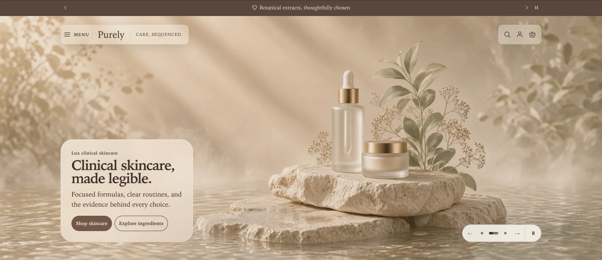
Full canvas
One image fills the hero and the text sits over it. This scene uses Soft glass and Bottom left.
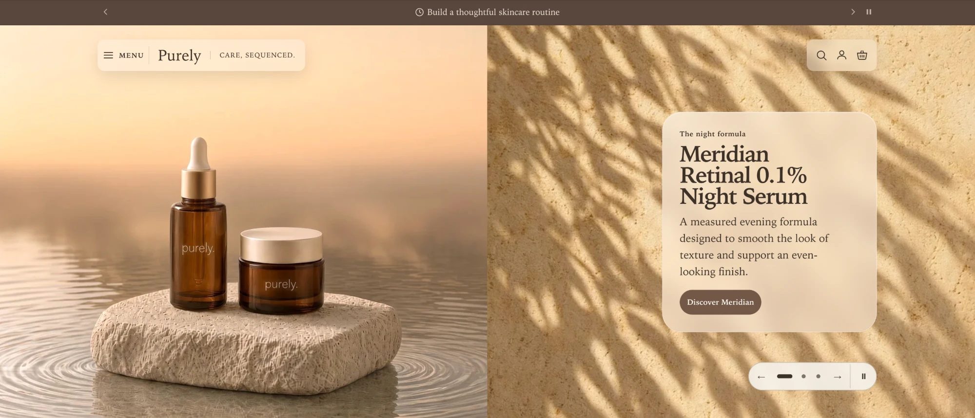
Media duo
Two pieces of media share the hero. Here the right-hand media is a video, and Content area is set to Second media, so the text panel sits inside it instead of straddling the seam. Each side can be an image or a video.
Editorial split has no text panel and no media overlay, because the text never touches the image. Content surface and Media overlay disappear from the editor when you choose it — that is expected, not a fault.
Place the text
Text placement is set per scene under Desktop layout:
- Content position has six choices: Middle left, Middle center, Middle right, Bottom left, Bottom center, and Bottom right. Bottom positions rest on the same edge as the scene dots and arrows, so the text and the controls read as one composed base.
- Text alignment is Left or Center and sets how the lines sit inside the text block.
- Content area appears only for Media duo. Whole scene positions the text against the full width, which can put a panel across the seam between the two images. First media and Second media confine the text to one image so the panel sits inside a single photograph. This applies above 750px, where the two images sit side by side.
The media always runs edge to edge. The text and the scene controls follow the same page-width column as every other section, so on a wide display the heading lines up with the content below it instead of floating out near the window edge.
Keep the text readable over your image
This is the part of the hero most worth spending time on. Three settings work together, and all three live under Style and Desktop layout:
- Media overlay darkens the image behind the text. The default of 25% suits most photographs.
- Content surface puts a panel behind the text. Solid is the scheme’s background color, Soft glass is a frosted panel, and No surface sets the text straight onto the image.
- Text color over media picks the light or dark half of your color scheme, and only applies when the surface is No surface.
Soft glass is the default and it looks best over images with something going on in them. It is partly transparent, so how readable it is depends on your photograph: over a very dark image the text can lose contrast. If your hero image is dark or heavily textured, switch Content surface to Solid. A solid panel is readable over any image, whatever you upload later.
With No surface, the text sits straight on the media, so it only works over a calm, even area of the image or video. This scene is a background video with No surface and Text color over media set to Dark. The screenshot is a single frame, so check the text against the whole clip, not just its opening.
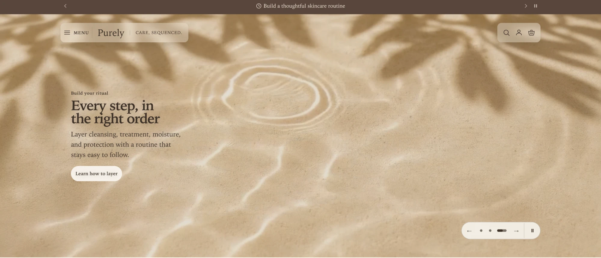
Check the result on your own image rather than on the placeholder. The overlay and surface that suit a bright studio shot are rarely the ones that suit a dim lifestyle photo.
Mobile is set up separately
Below 750px the hero rebuilds itself, and it uses its own settings rather than shrinking the desktop ones. Everything under Mobile layout is independent — set it, then look at it.
Mobile scene layout is the main choice:
| Mobile scene layout | Where the text goes |
|---|---|
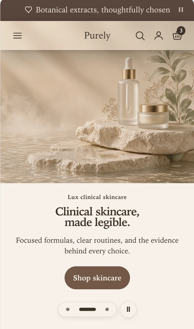
| Stacked story | Below the media, on the section background. Always readable. |
| Floating note | In a card overlapping the bottom of the media. The default. |
| Overlay text box | Over the media, like the desktop layout. |
Stacked story
Floating note
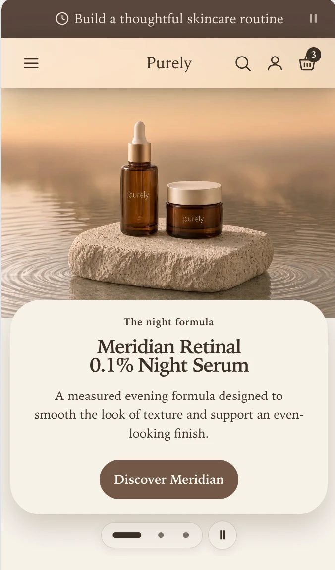
Overlay text box
Here with Mobile content surface set to No surface and dark text over a calm photograph.
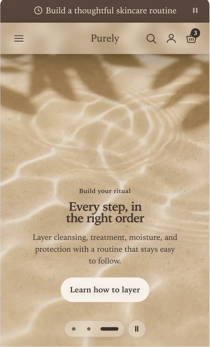
Only Overlay text box puts text on the photograph, so only it offers Mobile content surface, Overlay position, and Mobile vignette. Mobile vignette fades a band of your color scheme behind the text and works alongside the surface, which helps when a busy image makes text hard to read but you do not want a full panel.
Floating note width appears with Floating note and chooses Narrow or Wide for the card. Mobile text alignment is Left or Center, and is separate from the desktop alignment.
A phone screen is small, so you can drop parts of a scene on mobile without deleting them from desktop. Show eyebrow, Show body text, and Show secondary button each hide one piece below 750px. Mobile content size scales the eyebrow, body text, and buttons together — the heading is set by Heading size, which applies to both screen sizes.
If your scene uses Media duo, only the primary media shows on mobile. Turn on Show paired media to fit both in.
One scene, or a slideshow
Add a second Hero scene block and the section becomes a slideshow. The hero holds up to eight scenes. Past that, the scene dots no longer fit on a phone, so the theme stops you adding more. The controls appear on their own:
- Scene dots appear whenever there is more than one scene. You cannot turn them off, because they are how a shopper reaches scenes 2 and 3.
- Show scene arrows adds previous and next arrows beside the dots on desktop. Turning it off leaves the dots in place.
- Enable autoplay advances the scenes on its own, every Autoplay speed seconds. It is on by default and only has an effect when there are two or more scenes.
- Play background videos lets a scene’s video play while its scene is showing. Hero videos are silent and loop. Turn this off and they do not play, and shoppers see the video’s preview image.
- A pause control appears automatically whenever something is moving — autoplay is advancing two or more scenes, or a scene has a background video that is allowed to play. Motion control style chooses between a text label and a pause icon, and only appears when the pause control does.
Do not use the slideshow to fit more in. Most shoppers see only the first scene, so put the message you most want read there and treat later scenes as a bonus.
Motion and accessibility
Scene change animation sets how one scene gives way to the next: Soft fade, Rise into view, Soft scale, Slide across, Slide over, Slide away, or No motion.
Two things override it, and both are deliberate:
- Setting your theme’s global motion style to No motion turns off scene animation everywhere, whatever this setting says.
- A shopper whose device requests reduced motion gets no rotation and no playing video, even with autoplay on. Their scenes change instantly when they use the dots or arrows.
The hero also works with JavaScript turned off. The scenes simply stack down the page instead of layering, so nothing is lost or hidden.
Headings and search engines
On the home page, the first scene’s heading becomes the page’s main heading — the one search engines read as the subject of the page. Later scenes, and every scene on other templates, are sub-headings.
So give the first scene a real heading that describes your store. If you leave it blank, the theme falls back to your shop name so the page is never left without a main heading, but your own wording will almost always be better.
Heading size offers Small, Medium, and Large. All three shrink on mobile, so a heading that fits a phone at Large is still a display-sized heading on a desktop.
Speed
The hero’s first image is usually the largest thing on the page and the last thing to finish loading, which makes it the single biggest influence on how fast your store feels.
The theme does the technical work: it generates the responsive sizes for every screen and asks the browser to load the first scene’s image at high priority. Images in later scenes are loaded lazily, so adding a second or third scene does not slow down the first view. What the theme cannot do is shrink an oversized source file. Upload a JPG of a few hundred kilobytes, not a multi-megabyte export.
If something looks wrong
| What you see | What to check |
|---|---|
| Text is hard to read over the image | Raise Media overlay, or set Content surface to Solid. |
| You cannot add another scene | The hero holds up to eight. Remove a scene first. |
| The hero looks fine on desktop, cramped on a phone | Mobile layout is separate. Set Mobile scene layout, and use Mobile content size. |
| A setting you expected is missing | Some settings only apply to one layout. Content surface is hidden for Editorial split; Overlay position and Mobile vignette only appear for Overlay text box. |
| Scenes after the first never show | The shopper has to use the dots, unless Enable autoplay is on. |
| No pause button on a rotating hero | It only appears when autoplay has two or more scenes to move between, or when Play background videos is on and a scene has a video. A single still scene has nothing to pause. |
| The second scene’s image is slow to appear | Expected. Only the first scene’s image loads up front; the rest load lazily so they do not compete with it. |
Section settings
Every setting on the section itself, in the order it appears in the theme editor. Group headings match the editor's own grouping.
Desktop layout
Mobile layout
Sets the total height of the mobile hero, including media, content, and navigation.
Motion
Plays when a shopper moves between scenes. No motion in the theme's global motion style turns this off.
Adds previous and next arrows on desktop. Scene dots always appear when the section has more than one scene.
Blocks
Blocks are added, reordered, duplicated, and removed inside the section. Each type has its own settings.
Hero scene scene
Primary media
Secondary media
Content
Actions
Style
Desktop layout
Narrows content position to one half of the media duo. Applies above 750px, where both media sit side by side.
Applies when the content surface is No surface. Picks the matching color from the scheme.
Mobile layout
Displays the secondary media beside the primary below 750px. Off shows the primary media only.
Sets the panel behind the scene text below 750px, where the text sits under or over the media.
Fades a band of the color scheme behind the text so it stays readable over the media. Independent of the content surface.
Scales the eyebrow, body text, and buttons together below 750px. Set the heading with Heading size.