Header
Configurable Studio bar and Split dock header designs with responsive navigation, search, cart, multi-level menus, localization, and optional menu promotions.
- Merchant-addable
- Yes
- Settings
- 62
- Block types
- 6
- File
sections/header.liquid
When to use it
Every page. It lives in the header section group and cannot be removed.
Setting it up
- Edit it from any template — changes apply store-wide.
- Choose Header composition, then use Desktop navigation layout to select a visible rail or Menu drawer fallback. The illustrated recipes below provide complete starting points.
- Add the Logo block and upload your logo. It survives varying aspect ratios.
- Add a Menu block and point it at your main menu, created under Content → Menus in Shopify admin.
- Add Icons for search, account, and cart.
- Add Country and language if you sell in more than one market.
- Add a Menu promotion block if you want featured content inside a dropdown.
Where the content comes from
Shopify menus, cart, and localization. Blocks own the arrangement.
Notes and cautions
- Menus are built in Shopify admin, not here. The block only chooses which menu renders.
- Navigation rail remains your selected desktop layout. If the primary main menu cannot fit on one line, Studio temporarily uses its compact, one-row Menu drawer without changing the saved setting. Every primary, nested, secondary, and enabled routine link remains available there, and the rail returns automatically when enough space is available.
- Manifest rechecks the layout after resizing, web-font loading, page load, and theme editor section reloads. If keyboard focus is inside the rail when it collapses, focus moves to the visible Menu button.
- With JavaScript disabled, navigation wraps instead of clipping. Do not shrink menu text, clip links, or add horizontal scrolling to handle overflow. The Desktop navigation layout setting description also explains the automatic fallback.
- Dropdowns open on Enter and Space, move through with Tab, and close on Escape returning focus to the launcher.
Header design recipes
Use these recipes as complete starting points. Each one lists the exact Header section and block settings that create the design. The illustrations show the structure; your logo, color scheme, menus, icons, and hero media supply the final character.
Open Online Store → Themes → Customize, then select Header in the header group. Changes made there apply across the store.
Prepare the header once
Before choosing a design:
- In Content → Menus, create the menu you want shoppers to use. Top-level links are the primary navigation. Links nested beneath them become secondary and third-level navigation.
- In the Header section, add or keep one Logo, one Menu, and one Icons block.
- Open the Menu block and set Menu to the menu you created.
- Set the logo image and width under Theme settings → Logo. If no image is set, the Logo block displays the shop name and controls its weight and letter case.
- Add Country and language only when the store serves multiple markets or languages.
- Preview the home page, a product page, a collection page, and a phone width before publishing.
The desktop composition and mobile menu are separate decisions. Finish the desktop recipe first, then complete the mobile setup near the end of this guide.
Choose a design
| Design | Best for | Main characteristic |
|---|---|---|
| Editorial Studio header | Brands that want a visible rail or a closely related compact variation | Choose a rail without routines, a rail with routines, or a one-row Menu drawer, then choose Soft shadow or Fine outline |
| Split dock over a hero | Campaigns and highly visual launches | Menu, brand, and utilities float as separate surfaces |
Design 1: Editorial Studio header
Choose this when the main menu is part of the brand presentation and shoppers should see the main destinations immediately. Versions A–C use Soft shadow. Versions D–F repeat the same navigation choices with Fine outline.
A. Without routine links
Transparent preview
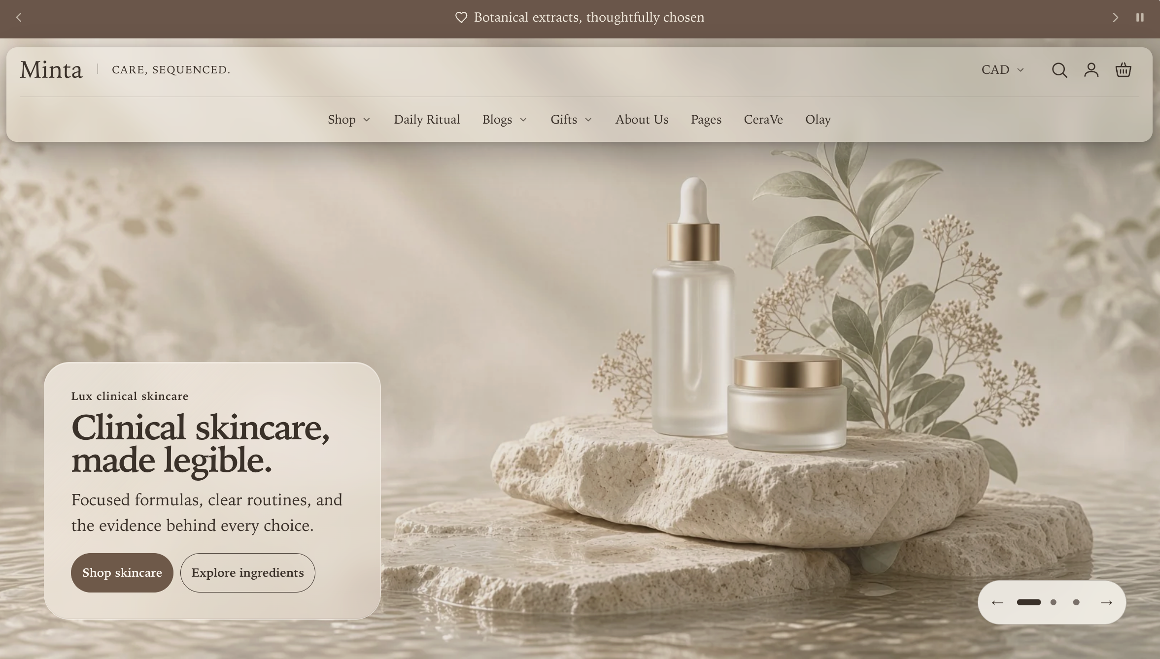
Solid preview
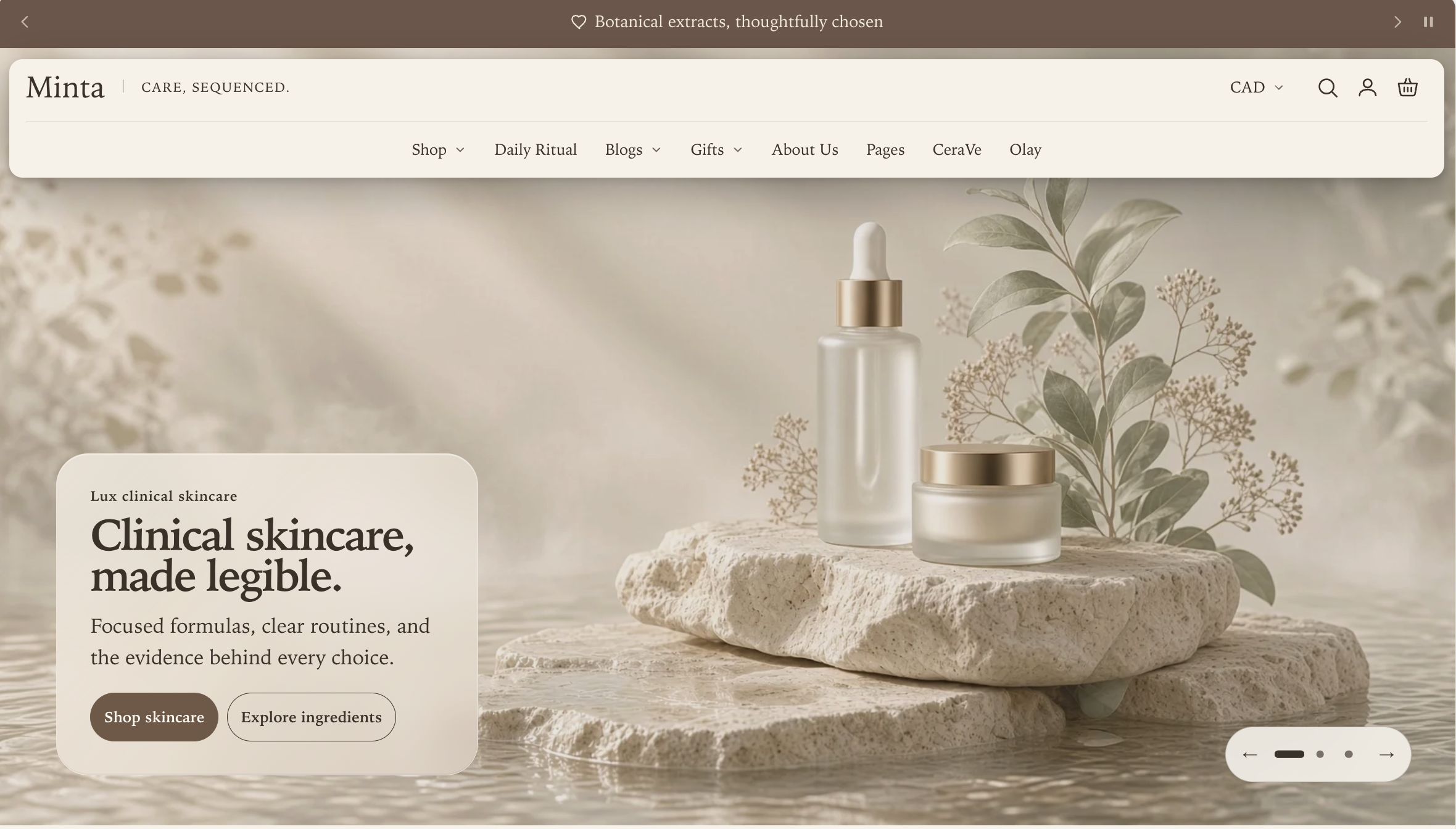
Header settings
| Setting | Value |
|---|---|
| Header composition | Studio bar |
| Desktop navigation layout | Navigation rail |
| Main menu alignment | Center for an editorial balance, or Left for a catalog-led layout |
| Desktop brand signature | A short phrase, or blank to hide it |
| Header background style | Transparent or Solid; compare the previews above |
| Surface finish | Soft shadow |
| Header behavior | Smart sticky on scroll |
| Show routine links on desktop | Off |
Menu block settings
| Setting | Recommended value |
|---|---|
| Desktop menu font size | Small or Medium |
| Show submenu arrows | On when the menu has nested links |
| Desktop menu letter case | Capitalize |
| Desktop submenu layout | Columns for broad groups; Fly-out panel for compact, deeper groups |
Keep top-level labels short and distinctive. If the primary menu cannot fit one line, Manifest temporarily shows the compact Menu drawer instead. The saved Navigation rail setting does not change, and the rail returns automatically when enough space becomes available.
B. With routine links
Transparent preview
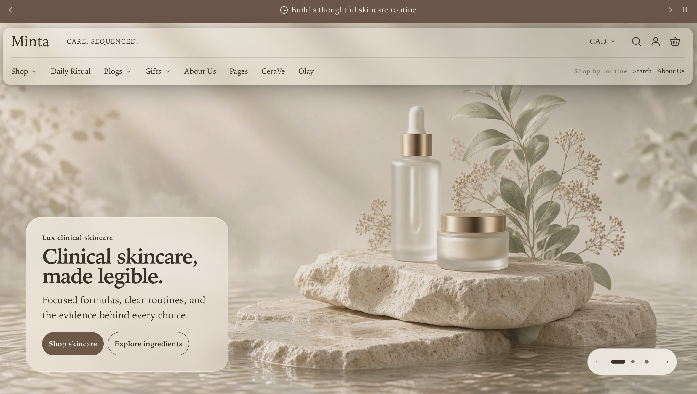
Solid preview
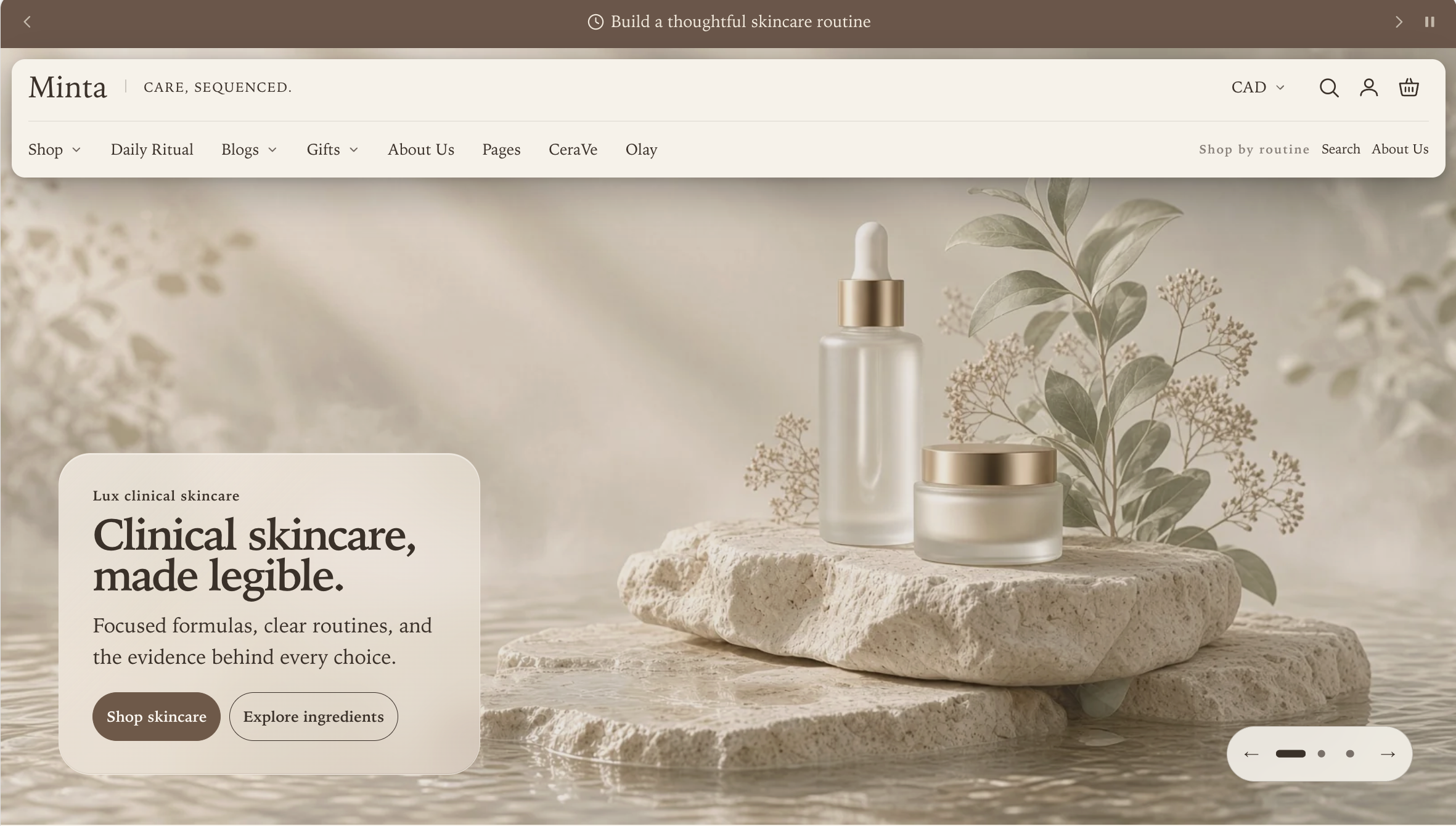
Start with every setting from version A, including Surface finish → Soft shadow, then apply only these additional settings:
| Location | Setting | Value for the illustrated design |
|---|---|---|
| Header section | Main menu alignment | Left |
| Menu block | Utility menu for desktop and mobile | A small menu containing Search and About Us |
| Header section | Show routine links on desktop | On |
| Header section | Show routine links on mobile | Off; configure mobile separately if needed |
| Header section | Routine links heading | Shop by routine |
| Header section | Maximum routine links on each device | 2 |
Create the utility menu under Content → Menus, then select it in the Header section’s Menu block. Search and About Us reproduce the screenshot, but you can use any two to five useful shortcuts. Do not repeat every primary link or use this group for policy links.
When space allows, the main menu stays on the left and the routine group sits on the right. When they cannot share one row, the routine group moves to its own row. If the primary main menu itself cannot fit one line, Manifest temporarily switches to the complete Menu drawer so every link remains available.
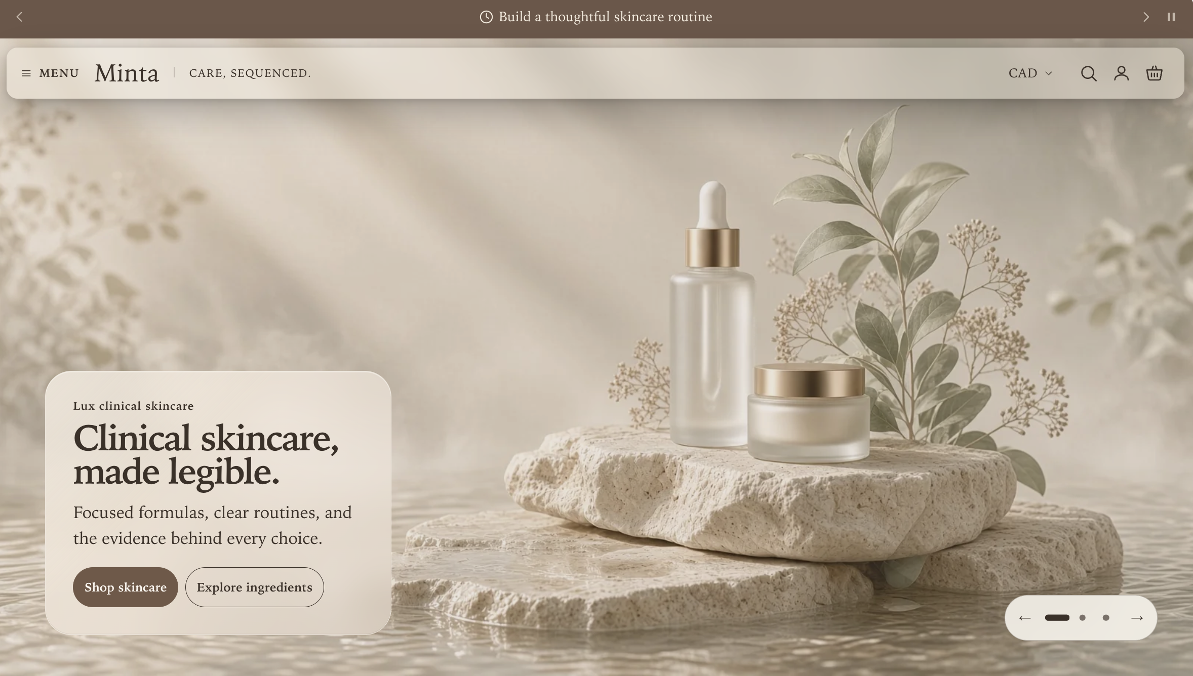
C. Compact Menu bar
Transparent preview
Solid preview
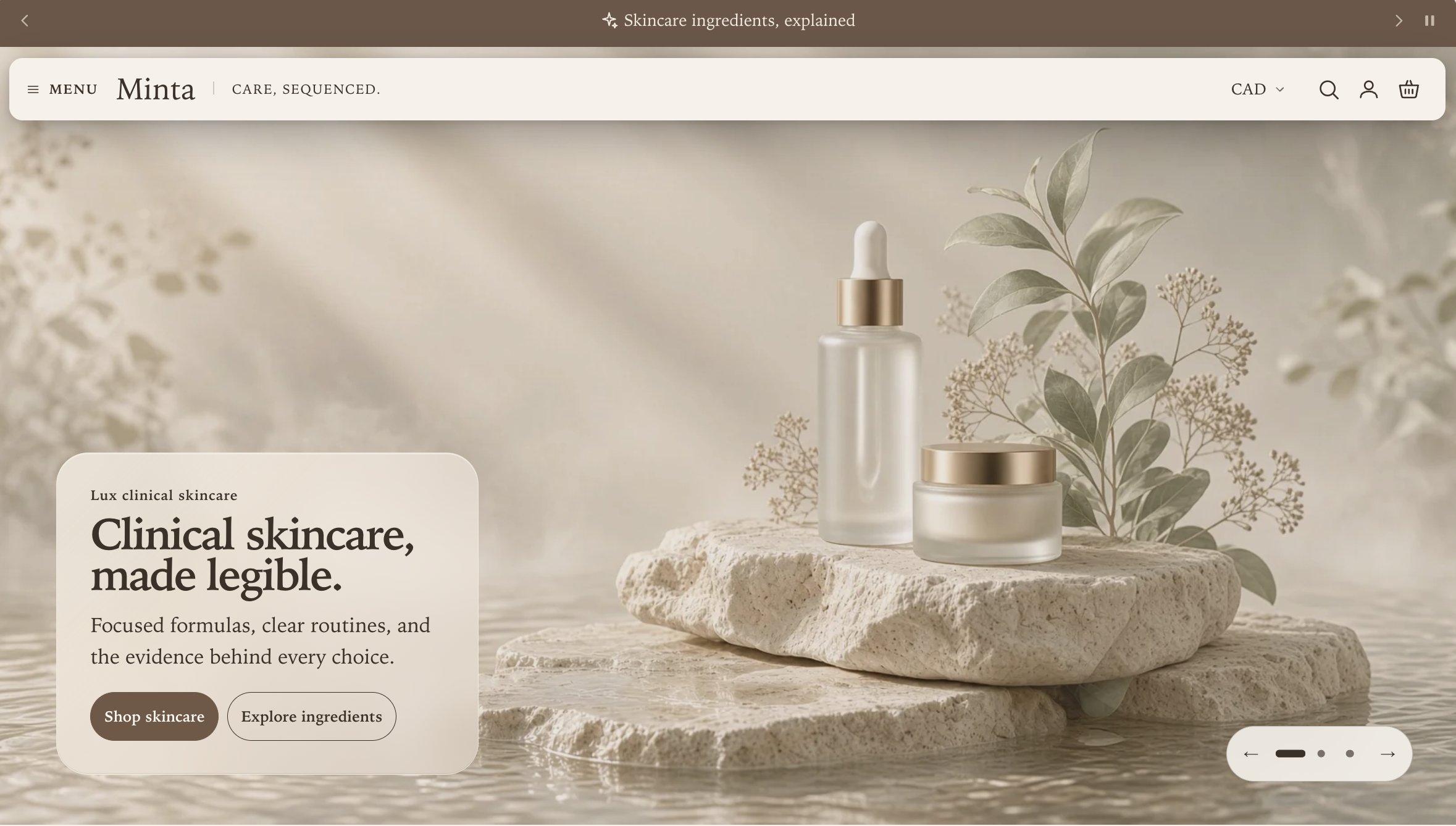
Start with version A, including Surface finish → Soft shadow, and change one setting:
| Location | Setting | Value |
|---|---|---|
| Header section | Desktop navigation layout | Menu drawer |
That single change removes the visible rail and places a labeled Menu button beside the brand in one compact row. Your main, nested, secondary, and enabled routine links remain available inside the complete menu. The Desktop menu opening style setting then controls whether that button opens a Navigation panel or a Side drawer; it does not change the closed appearance shown here.
Choose a solid or transparent background
The background treatment does not create a separate header design. Keep the same version and select Header background style → Solid for an opaque header, or Transparent when a compatible full-bleed Hero banner or Product stage opens the page. For a transparent header, set Transparent header text to Light over dark imagery or Color scheme over pale imagery. Pages without compatible opening media use the solid, readable header automatically.
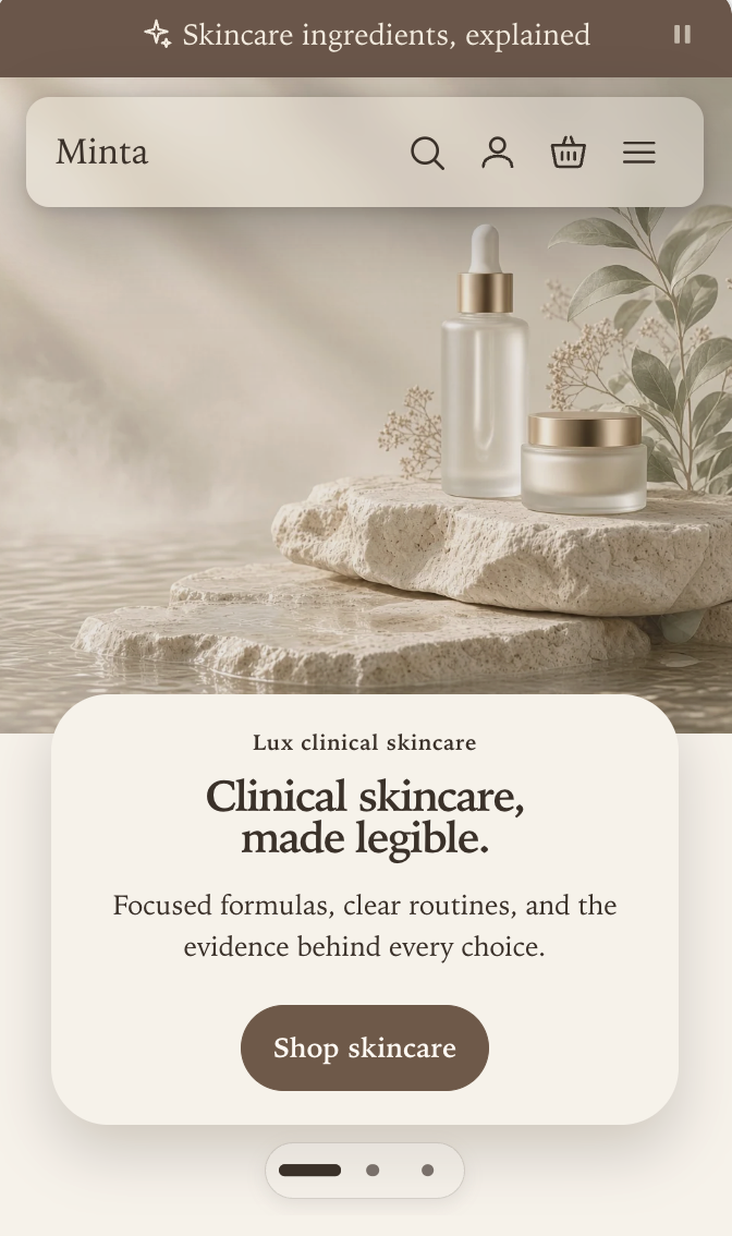
Mobile appearance for A, B, and C
Transparent preview
Solid preview
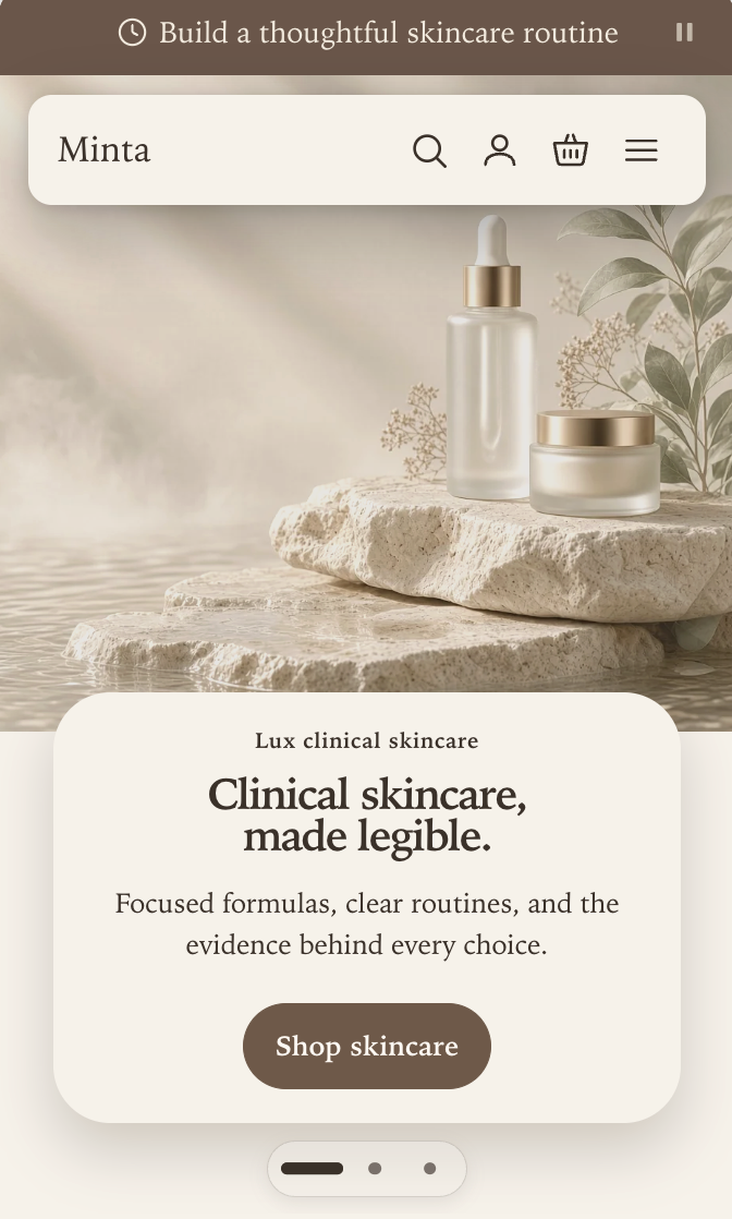
All three desktop versions use the same compact mobile header when routine links are disabled on mobile. To reproduce the screenshot, set Mobile logo position to Start, Mobile menu opening style to Navigation panel, and Show routine links on mobile to Off. Search, account, cart, and the Menu button remain visible in one row. The desktop rail and its alignment do not carry into the mobile layout.
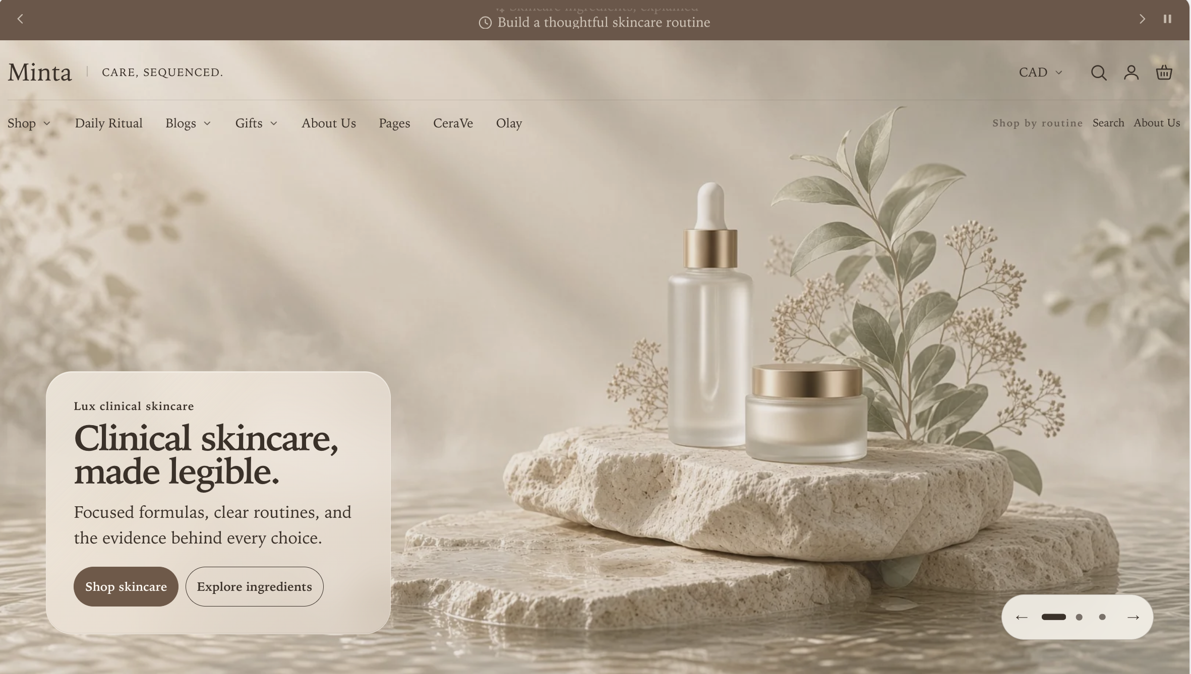
D. With routine links and Fine outline
Transparent preview
Solid preview
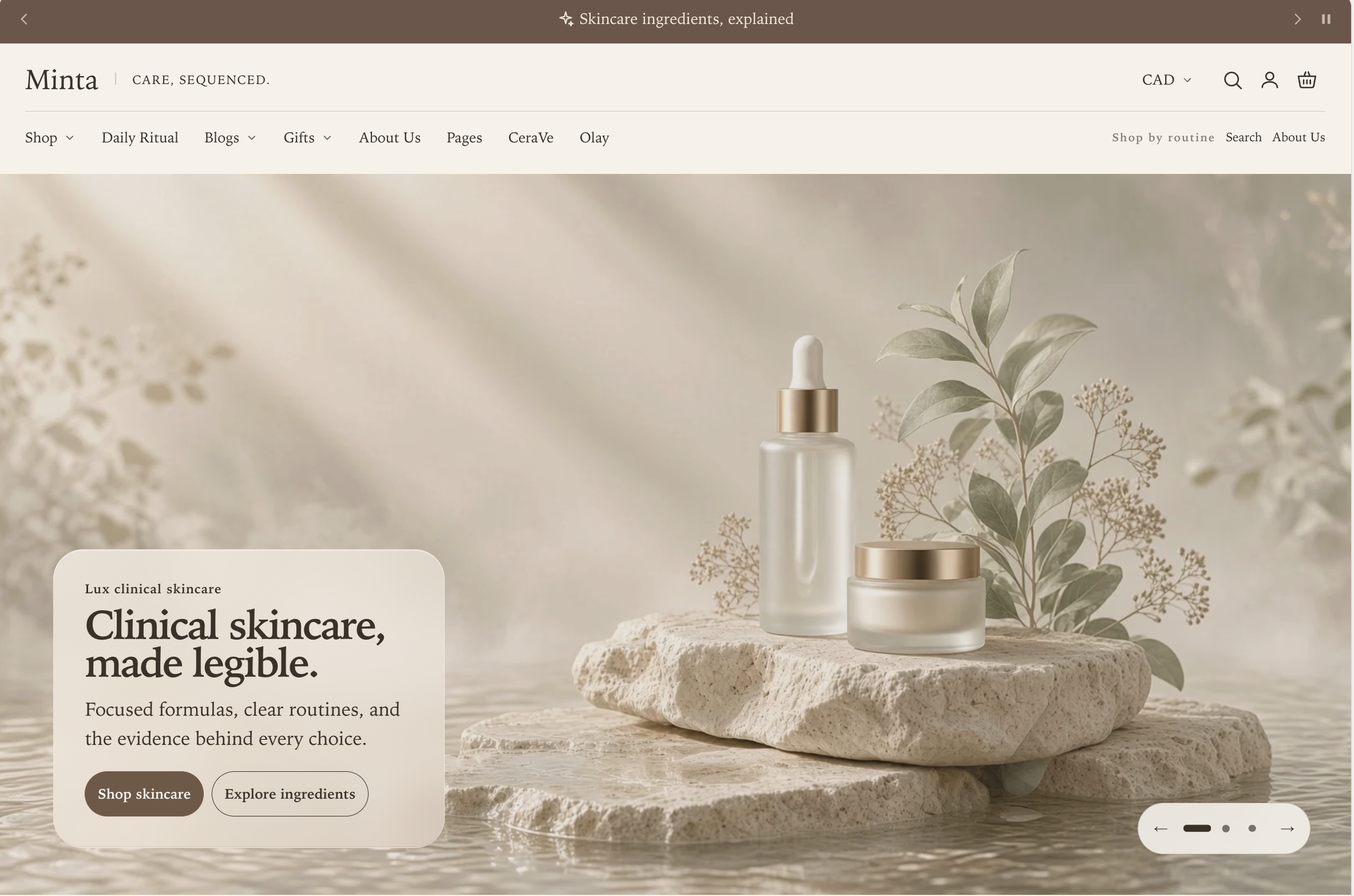
Start with every setting from version B and change one setting:
| Location | Setting | Value |
|---|---|---|
| Header section | Surface finish | Fine outline |
This keeps the main menu on the left and the routine group on the right when space allows. The same automatic Menu drawer fallback protects every link when the primary menu cannot fit on one line.
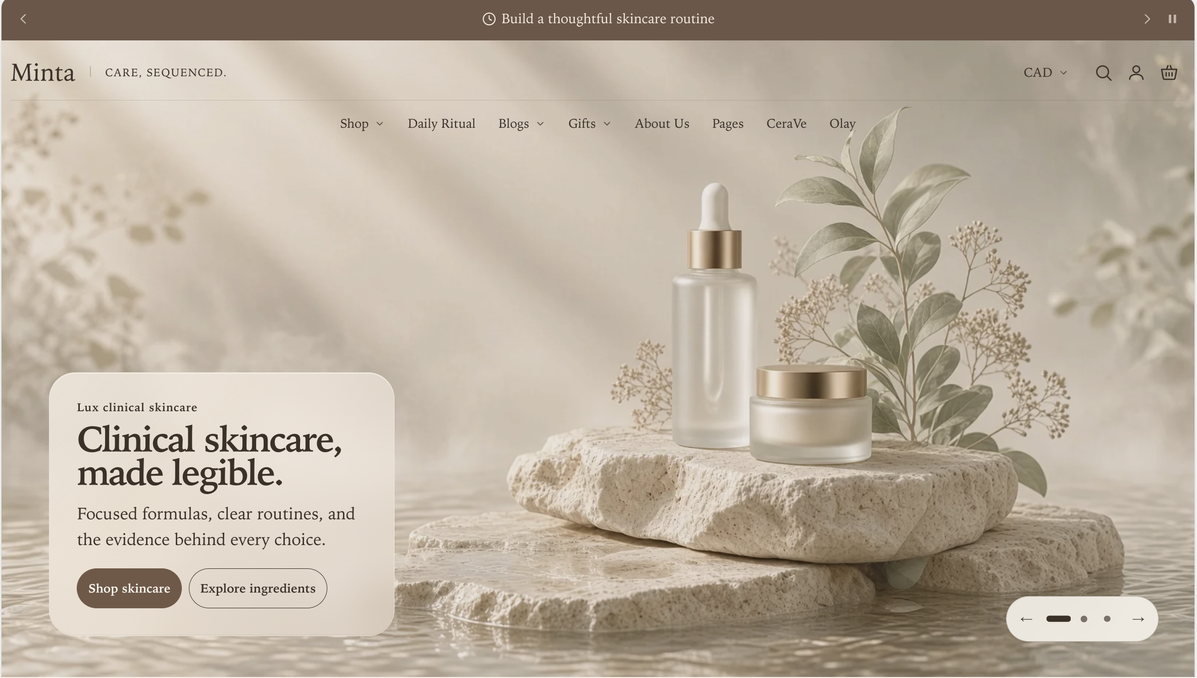
E. Without routine links and Fine outline
Transparent preview
Solid preview
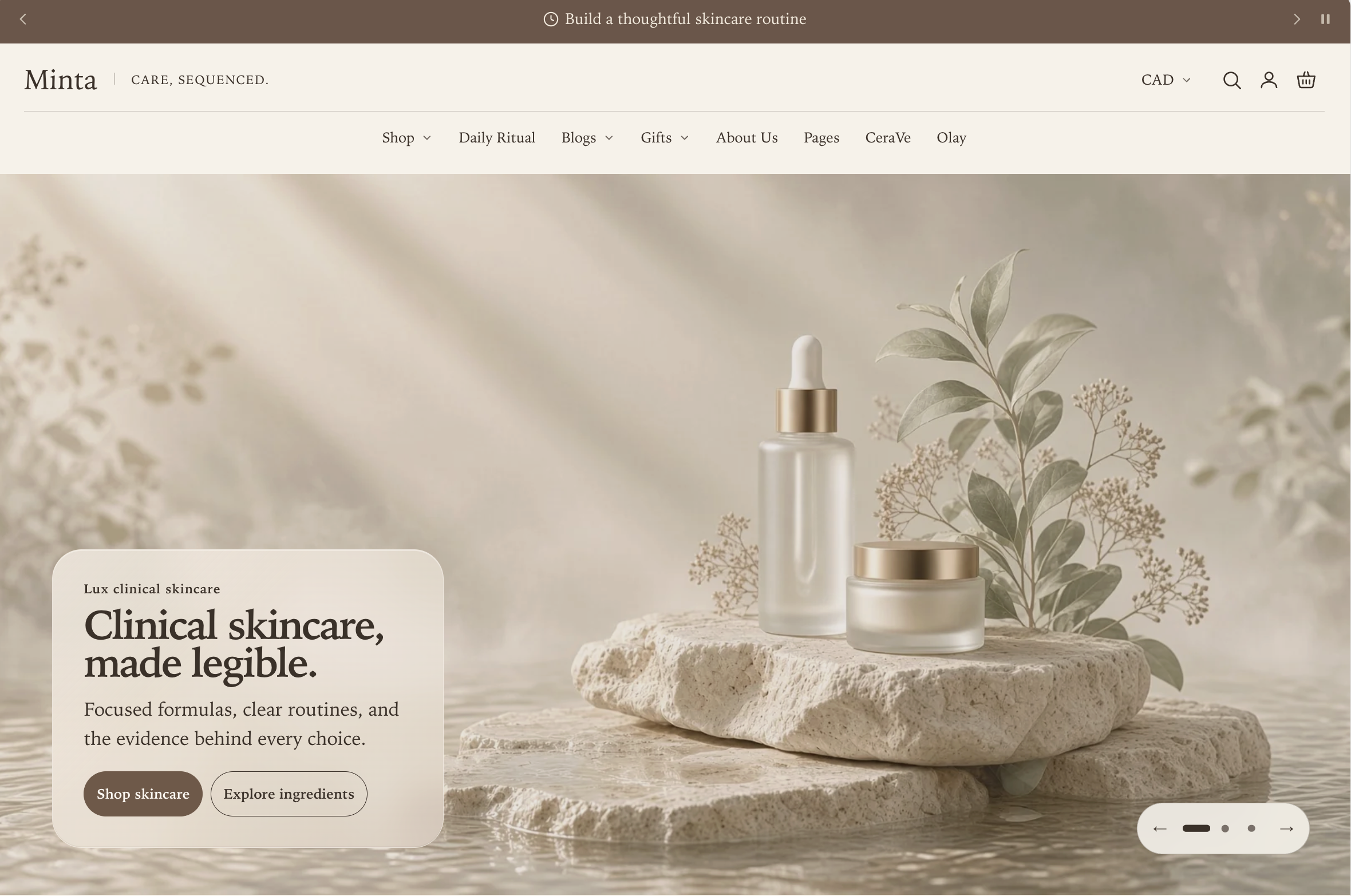
Start with every setting from version A and change one setting:
| Location | Setting | Value |
|---|---|---|
| Header section | Surface finish | Fine outline |
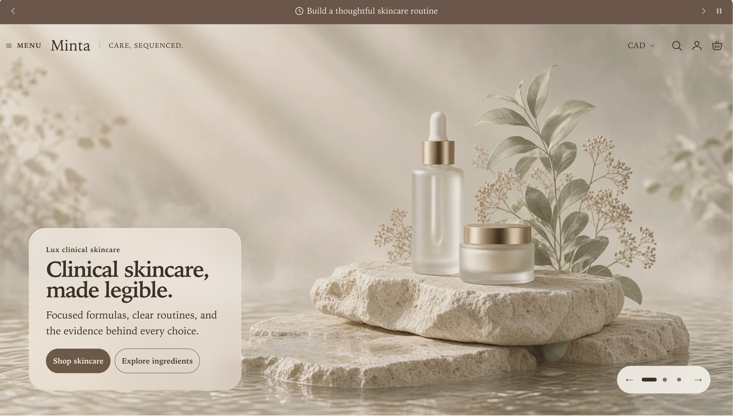
F. Compact Menu bar with Fine outline
Transparent preview
Solid preview
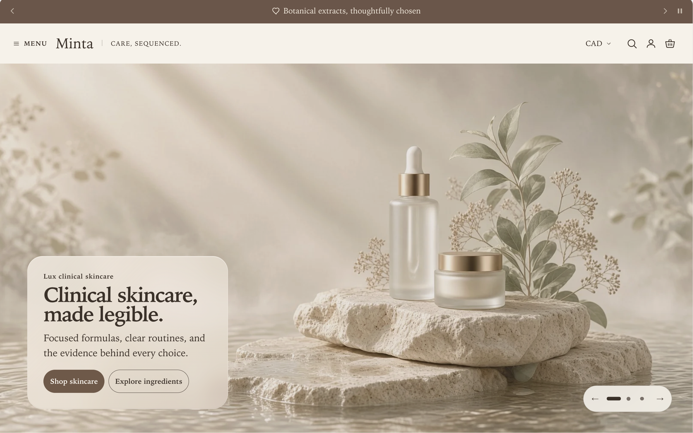
Start with every setting from version C and change one setting:
| Location | Setting | Value |
|---|---|---|
| Header section | Surface finish | Fine outline |
Mobile appearance for D, E, and F
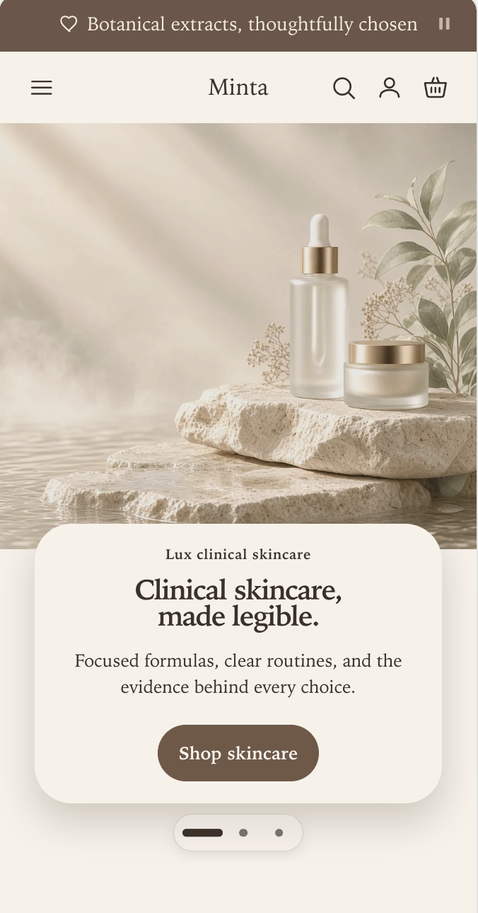
Versions D, E, and F share this compact mobile arrangement. To reproduce the screenshot, set Mobile logo position to Center, Mobile menu opening style to Navigation panel, and Show routine links on mobile to Off. The Menu button moves to the start of the row, while search, account, and cart remain at the end.
Design 2: Split dock over a hero
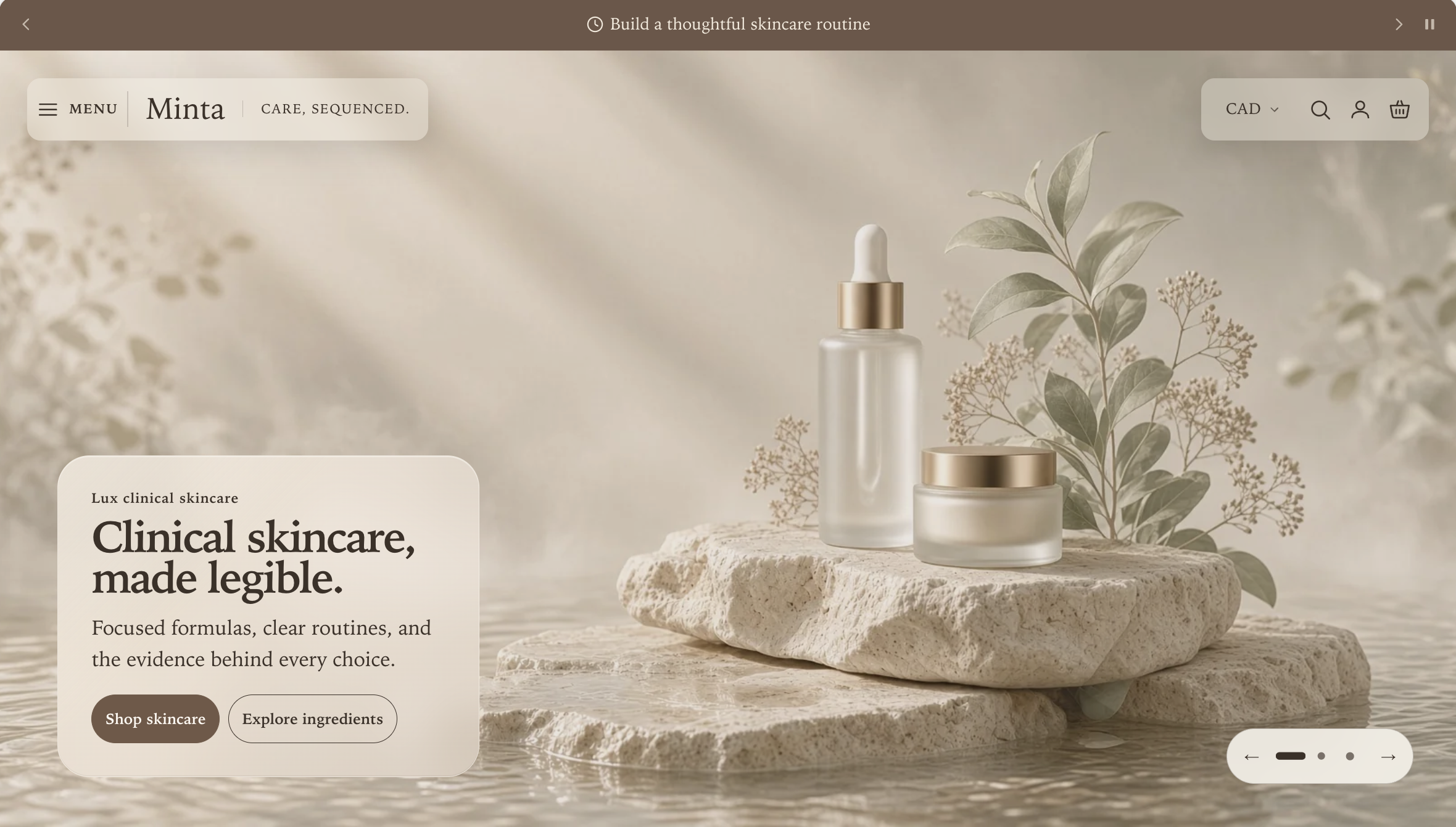
Choose this for the most visual composition. Split dock separates the Menu button, brand, and utilities into floating surfaces so the opening image remains visible between them.
A. Without routine links
Transparent preview
Solid preview
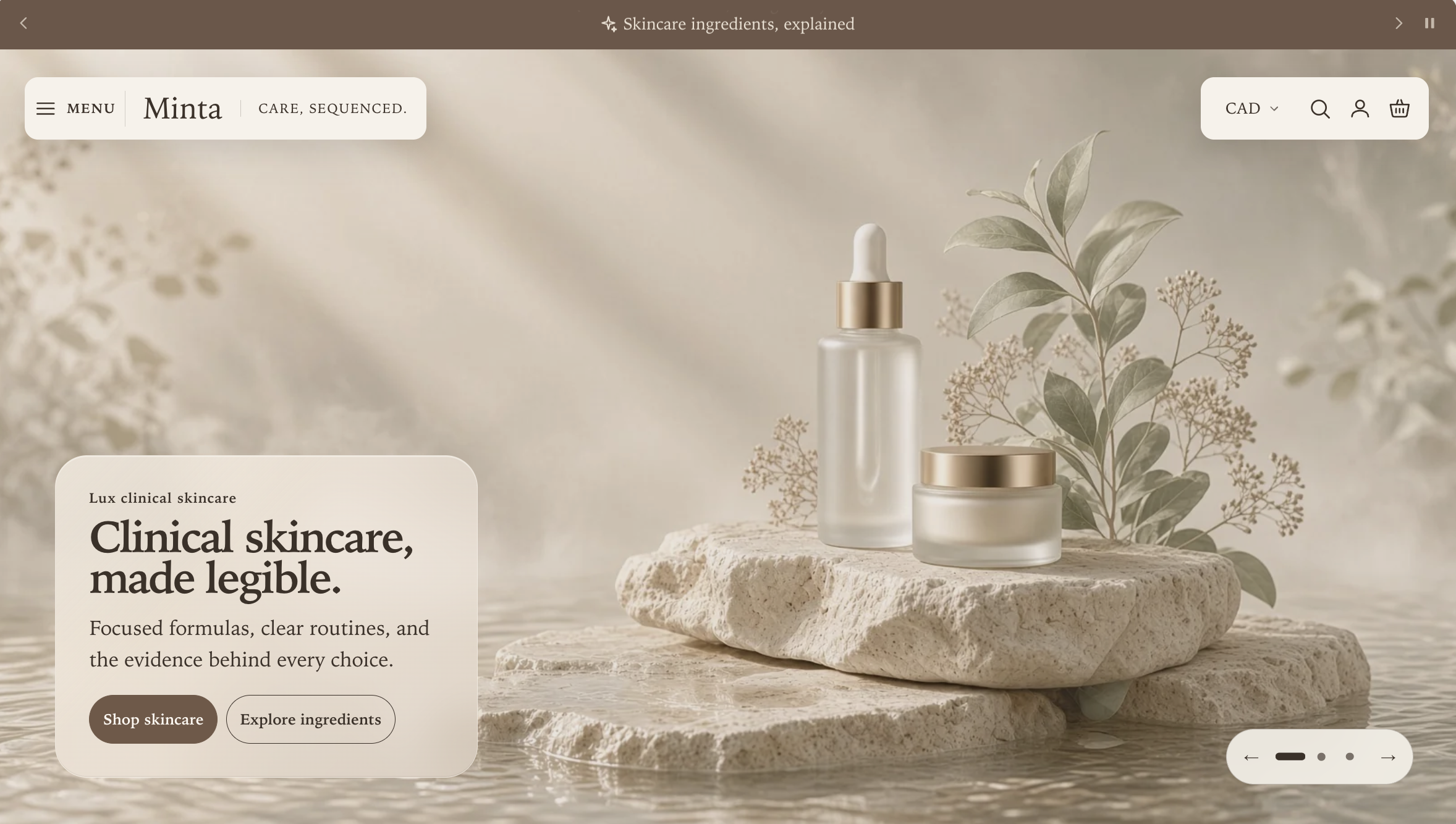
Header settings
| Setting | Value |
|---|---|
| Header composition | Split dock |
| Desktop navigation layout | Navigation rail |
| Desktop menu opening style | Navigation panel |
| Header background style | Transparent or Solid; compare the previews above |
| Transparent header text | When the background is Transparent, use Color scheme over pale imagery or Light over dark imagery |
| Apply soft shadow | On |
| Header behavior | Smart sticky on scroll |
| Show routine links on desktop | Off |
The Menu button and brand share the left dock while country, search, account, and cart occupy the right dock. Desktop navigation layout → Navigation rail also defines the Studio fallback used on pages that do not begin with compatible full-bleed media. Changing Header background style changes only the surface treatment: Transparent allows the hero to show through the dock, while Solid uses the selected color scheme.
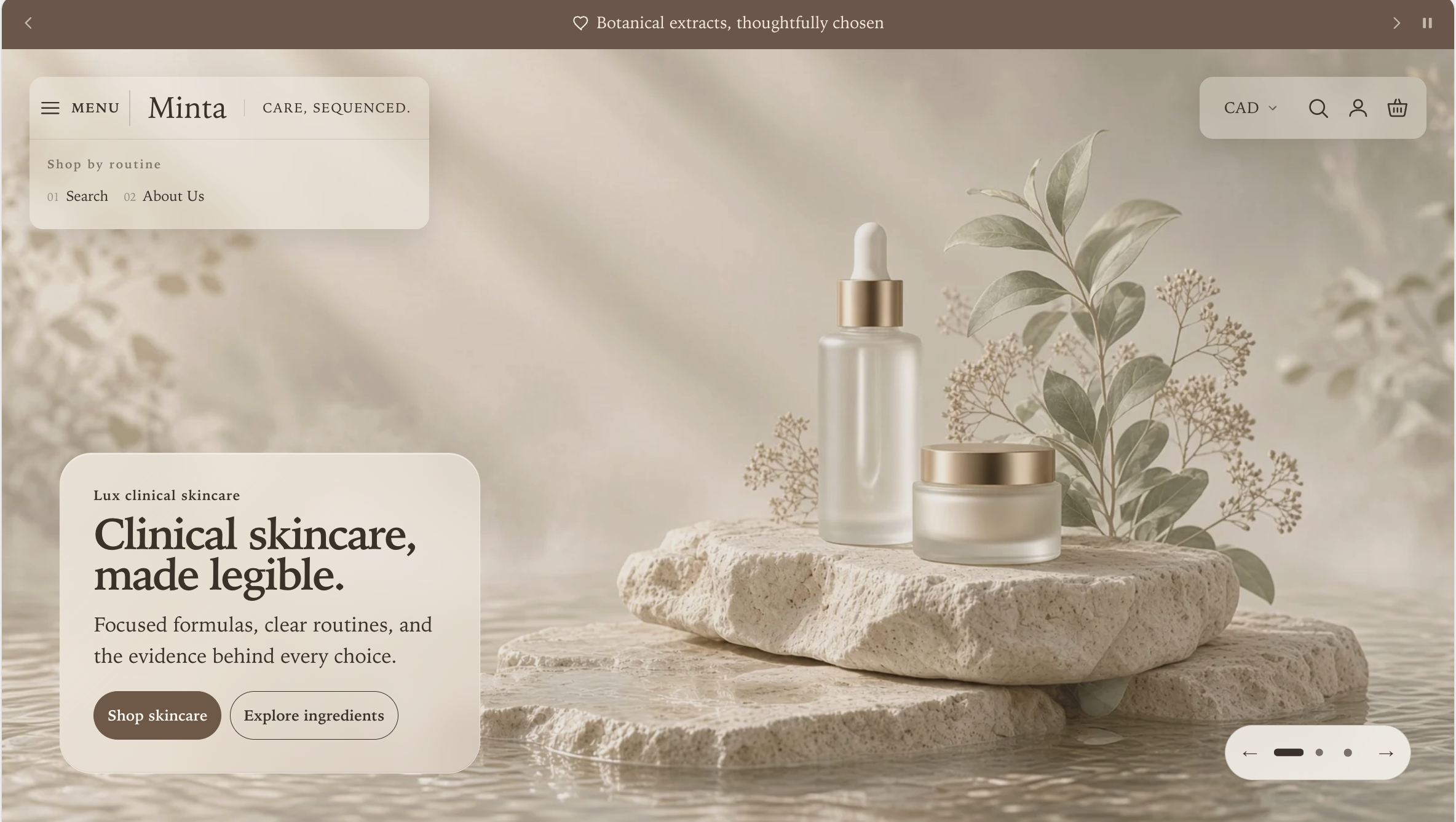
B. With routine links
Transparent preview
Solid preview
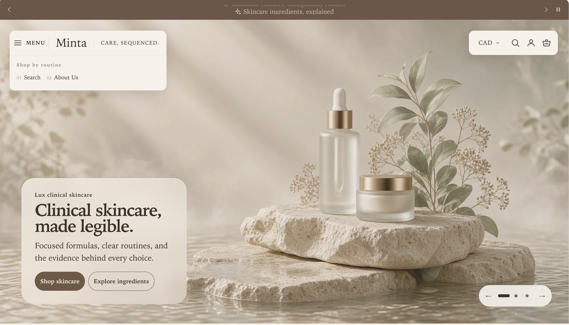
Start with every setting from version A, then apply these additional settings:
| Location | Setting | Value for the illustrated design |
|---|---|---|
| Menu block | Utility menu for desktop and mobile | A small menu containing Search and About Us |
| Header section | Show routine links on desktop | On |
| Header section | Show routine links on mobile | Off |
| Header section | Routine links heading | Shop by routine |
| Header section | Maximum routine links on each device | 2 |
With the Navigation rail fallback selected, Split dock places enabled routine links below the brand in the left floating surface. If Desktop navigation layout is changed to Menu drawer, the routine links remain available inside the complete menu instead of appearing in that surface.
Mobile appearance for A and B
Transparent preview
Solid preview
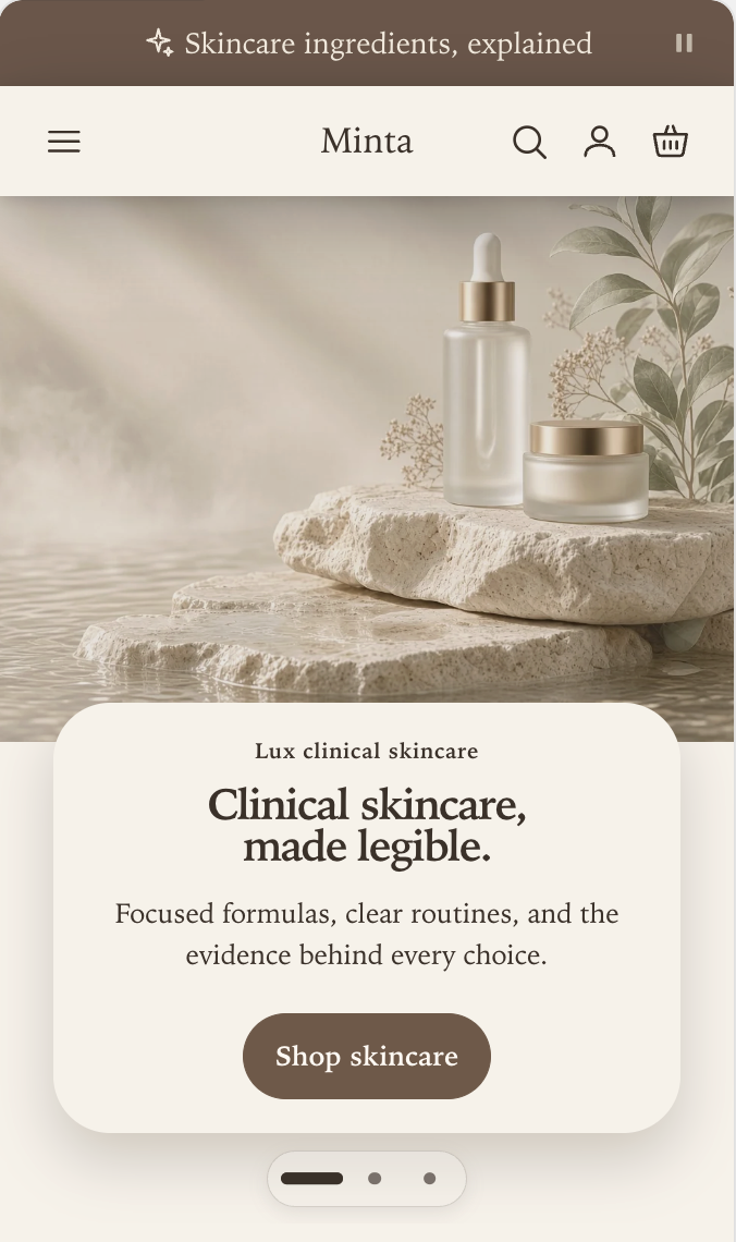
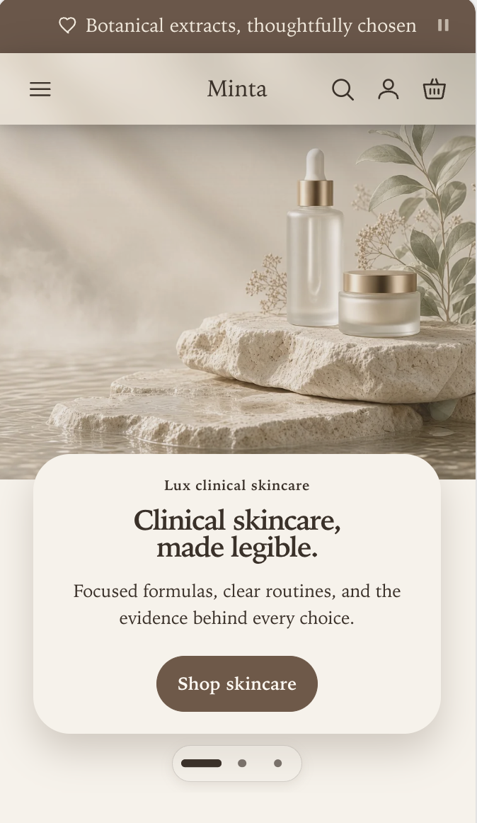
Both versions use this mobile arrangement when Show routine links on mobile is off. Set Mobile logo position to Center and Mobile menu opening style to Navigation panel. The Menu button remains at the start, the logo is centered, and search, account, and cart remain at the end.
Split dock appears only when the page opens with a compatible full-bleed Hero banner or Product stage. Everywhere else, Manifest uses the corresponding Studio fallback:
- Navigation rail gives those pages a visible Studio rail.
- Menu drawer gives those pages a compact, one-row Studio header.
This fallback is intentional. It keeps the header readable when there is no opening image for the floating dock to sit over.
Routine links in other designs
Routine links are short, repeated entry points such as Morning, Evening, Sensitive skin, or Travel. They come from the Utility menu for desktop and mobile selected in the Menu block. Design 1B shows the complete setup for a Studio navigation rail. In the other designs, the same menu is placed as follows:
Where the links appear depends on the chosen design:
| Design | Routine-link placement |
|---|---|
| Studio with Navigation rail | In the rail when space allows; otherwise on its own row |
| Studio with Menu drawer | Inside the complete navigation menu |
| Split dock with Navigation rail fallback | In the floating routine rail and in the Studio fallback |
| Split dock with Menu drawer fallback | Inside the complete navigation menu |
Use this menu for genuinely useful alternate paths, not for policy links or a second copy of every primary destination.
Build nested menus and promotions
The structure is controlled in Content → Menus:
- Top-level links are primary navigation.
- Links nested one level below are secondary navigation.
- Third-level links use the Desktop submenu layout selected in the Menu block when the visible Navigation rail is active.
Columns
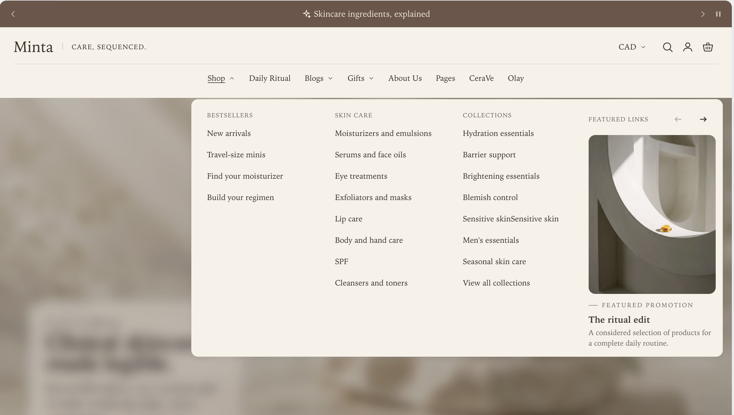
Set Menu block → Desktop submenu layout to Columns when shoppers benefit from seeing several groups and their links at once.
Broad nested menu
Shallow menu
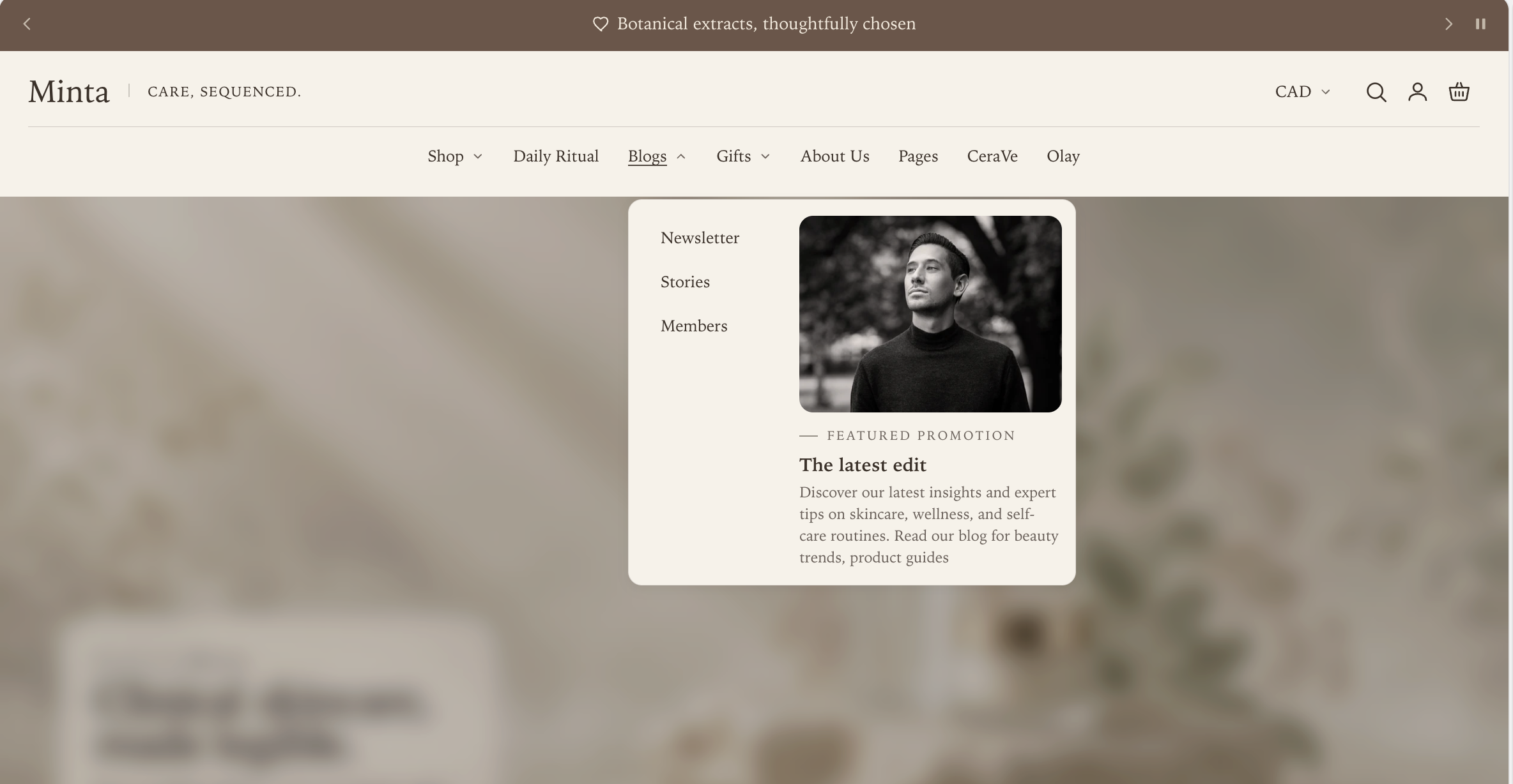
A deeply nested menu uses each secondary link as a column heading and places its third-level links below it. A shallow menu stays compact because there are no third-level groups to expand. Menu promotion blocks appear alongside the links when they are attached to the open top-level item.
Fly-out panel
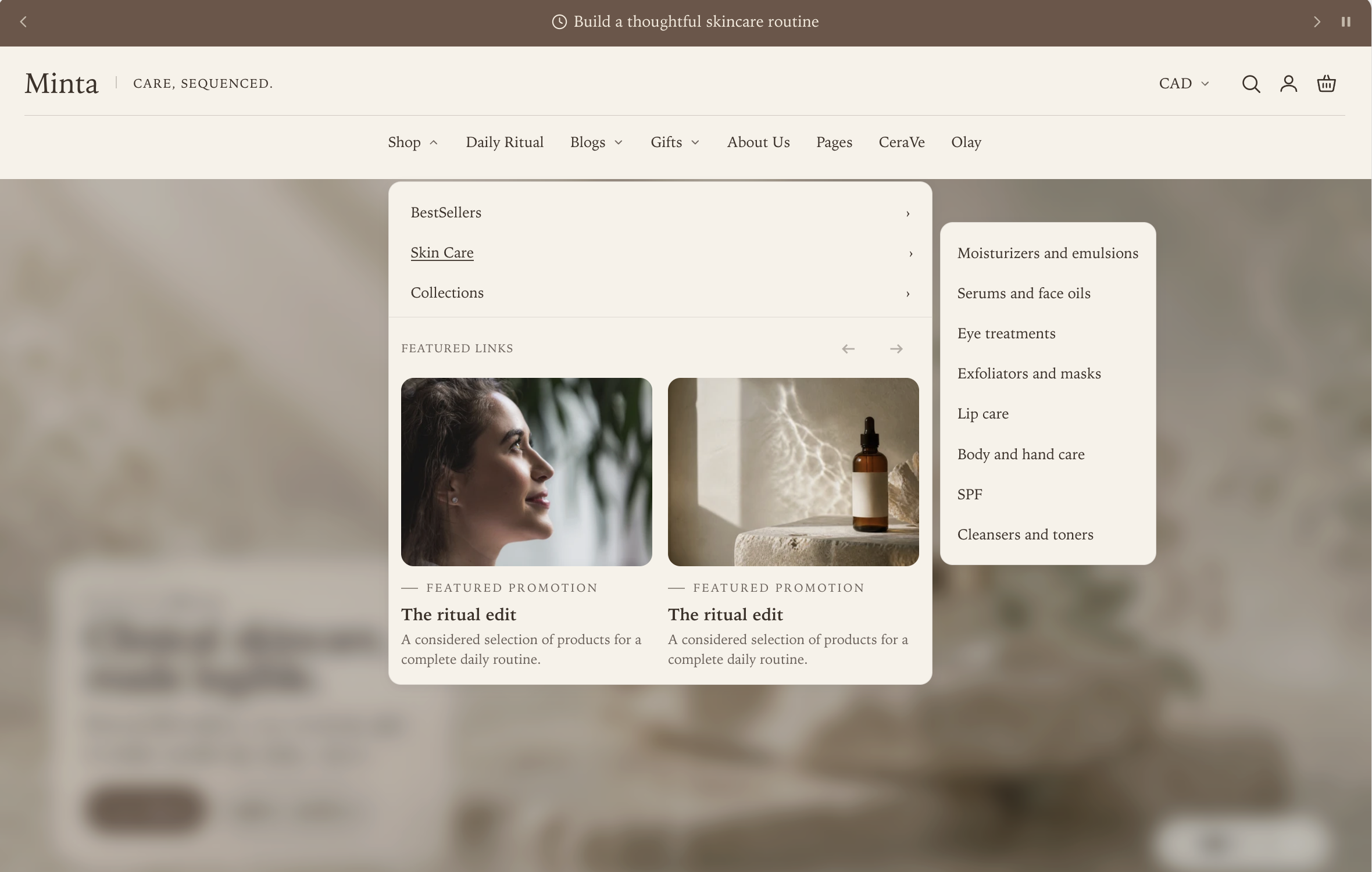
Set Menu block → Desktop submenu layout to Fly-out panel when the first choice should stay compact and shoppers can open one deeper group at a time.
Nested group open
Shallow menu
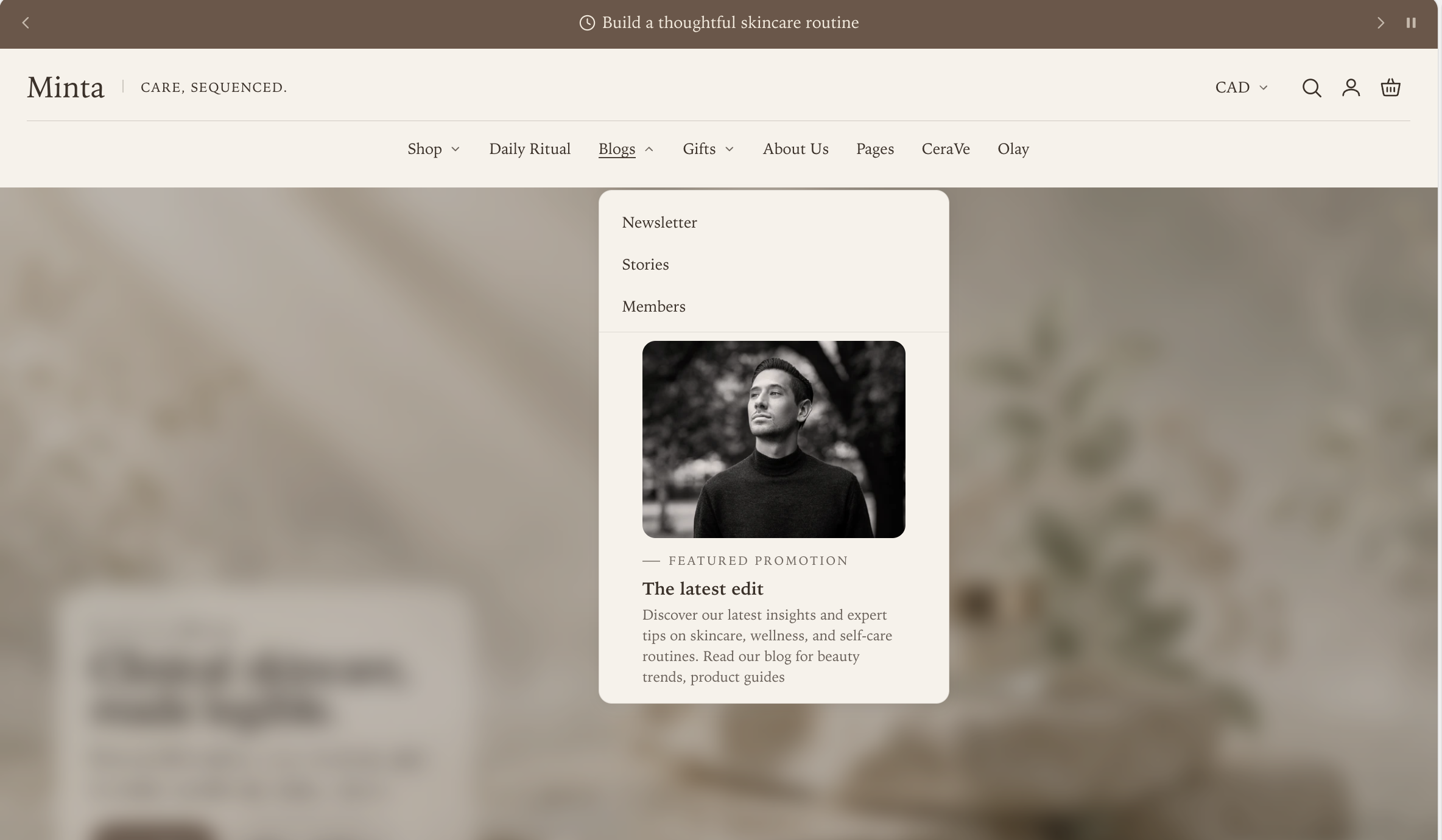
Secondary links stay in the parent panel. Opening a link that has children reveals its third-level links in the adjacent panel. A shallow menu does not create an empty fly-out; it remains a single compact panel. Promotions remain in the parent panel.
To add visual content to a menu, add a Menu promotion block in the Header section:
- Enter the exact top-level link label under Attach to menu item.
- Choose a Promotion image and its ratio.
- Add meaningful Alt text.
- Add the eyebrow, heading, subheading, link, and link label.
- Add more promotion blocks with the same top-level label to create a browsable promotion rail.
If a promotion does not appear, compare Attach to menu item with the Shopify menu label, including spaces and punctuation.
Set up mobile navigation
Mobile uses the same main menu but has its own presentation settings.
| Setting | How to choose |
|---|---|
| Mobile logo position | Start keeps the row directional; Center creates a symmetrical brand lockup |
| Mobile menu opening style | Navigation panel gives the menu an editorial overview; Side drawer uses a familiar vertical hierarchy |
| Show routine links on mobile | Turn on only when those shortcuts are useful on a small screen |
Open the phone preview and test at least one menu branch through every nesting level. Also open search, the country and language selector, the account menu, and the cart so the complete header flow is checked rather than only its closed appearance.
Understand the automatic rail fallback
Navigation rail remains the layout you selected. When the primary menu cannot fit on one line, Manifest temporarily switches the Studio header to its compact, one-row Menu drawer. The saved setting is not changed. Every primary, nested, secondary, and enabled routine link remains available in the drawer, and the rail returns when sufficient space becomes available.
Manifest measures again after the browser is resized, web fonts finish loading, the page loads, or the Header section reloads in the theme editor. If keyboard focus is inside the rail when it collapses, focus moves to the visible Menu button.
With JavaScript disabled, navigation wraps instead of clipping. Do not shrink menu text, clip links, or introduce horizontal scrolling to force a long menu into one line. Shorten unclear labels or use the Menu drawer design when a compact header is the intended look.
Finish the shared details
These settings can be applied to every recipe:
- Color scheme controls the solid header and fallback colors.
- Header behavior can be Smart sticky on scroll, Always sticky, or Static. Smart sticky is the balanced default because it returns when a shopper scrolls upward.
- Blur background behind open menus separates navigation, search, and localization surfaces from the page beneath them.
- The Icons block selects outline or filled icons, hover behavior, search and account visibility, the account menu, and the cart icon.
- The Country and language block controls how the current country or currency is labeled. Add it only when the corresponding Shopify Markets options are configured.
Before publishing, check the header with the longest translated labels you expect to support. The automatic fallback protects access to every link, but the chosen design should still look deliberate in the languages your store serves.
Section settings
Every setting on the section itself, in the order it appears in the theme editor. Group headings match the editor's own grouping.
Studio bar uses a two-level editorial structure. Split dock appears only above a compatible full-bleed opening section; every other page uses the Studio fallback configured below.
Desktop layout
Navigation rail shows the main menu below the Studio brand and automatically switches to the Menu drawer when links do not fit one line. It also displays enabled Split dock routine links. Menu drawer keeps Studio to one row and moves Split dock routine links into the full menu. On other pages, Split dock uses the corresponding Studio fallback.
Choose how the full menu opens from the header.
Makes the open menu panel slightly transparent so the page shows through behind it.
Choose whether the main menu starts at the left or sits in the center of the navigation rail.
Use a short phrase beside the desktop logo. Longer text is truncated with an ellipsis. Leave blank to hide it.
Mobile layout
Choose whether the logo starts the mobile header row or sits in the center.
Choose how the full menu opens from the header.
Routine links
Choose the Utility menu in the Menu block to populate these links. With Split dock, Navigation rail shows them below the brand while Menu drawer keeps them inside the full menu.
Uses the same Utility menu and maximum link count as the desktop routine links.
Used on each device where routine links are shown.
Sets one shared limit for desktop and mobile.
Behavior and appearance
Solid uses your color scheme. Transparent overlays the first home-page hero. Split dock retains readable floating surfaces over the hero. Every other page stays solid.
Light suits dark imagery. Color scheme suits pale imagery.
Controls Studio surfaces on desktop and mobile. Corners follow Theme settings → Layout → Corner style.
Applies the Studio bar soft-shadow treatment to the Split dock surfaces.
Softly blurs the page behind the menu, dropdowns, search, and country selector while they are open.
Blocks
Blocks are added, reordered, duplicated, and removed inside the section. Each type has its own settings.
Logo logo_block max 1
Set the logo image and width in Theme settings → Logo. This block controls the shop-name text shown when no logo is set.
Icons icons_block max 1
Appearance
Applies to all header icons. They follow your color scheme.
Controls
Links shown in the header account menu. Leave this empty to show the default account links.
Country and language currency_selector max 1
What shows in the country selector. Currency follows the selected country.
Cart drawer cart_drawer max 1
Samples
Offered as the samples. Each product is added with its first available variant, so use single-variant sample products.
Used when no sample products are selected. The collection supplies its own product order.
The most samples a customer can keep in the cart at one time.
Samples are regular products at the price set on each product, and inventory applies. A sample shows as free only when its price is 0.
Gift options
Leave this empty to offer a gift message only. Choose an active product. The first available variant is used, and product data provides the title, image, price, and availability.